Before I moved to San Diego, I lived in Irvine, and one of the things I appreciated about Orange County was how many everyday places carried a real environmental point of view.
I kept finding myself drawn to restaurants that felt like more than rooms with tables. Some had strong theming. Some had layered set dressing. Some simply understood mood, material, lighting, and spatial variety. As a scenic designer, I have a hard time turning that part of my brain off. I notice how a space introduces itself. I notice where the light pools. I notice whether a courtyard, bar, and dining room feel like separate ideas or parts of the same world.
There are many other Orange County restaurants I wish I had visited while I was living there. I know this list could be much longer. But when life is busy, it is hard to plan weeks in advance, chase reservations, or build an entire evening around a waitlist. The places I kept returning to were accessible. They offered atmosphere on an ordinary night.
That is where restaurant design starts to overlap with themed entertainment for me. Not every environment needs to be fully immersive to be memorable. Sometimes the attraction is a brick courtyard, a dark tiki booth, a glowing patio, a fantasy stairwell, or a wall so densely dressed that it becomes its own kind of scenic backdrop.
These are five Orange County restaurant environments that stayed with me.
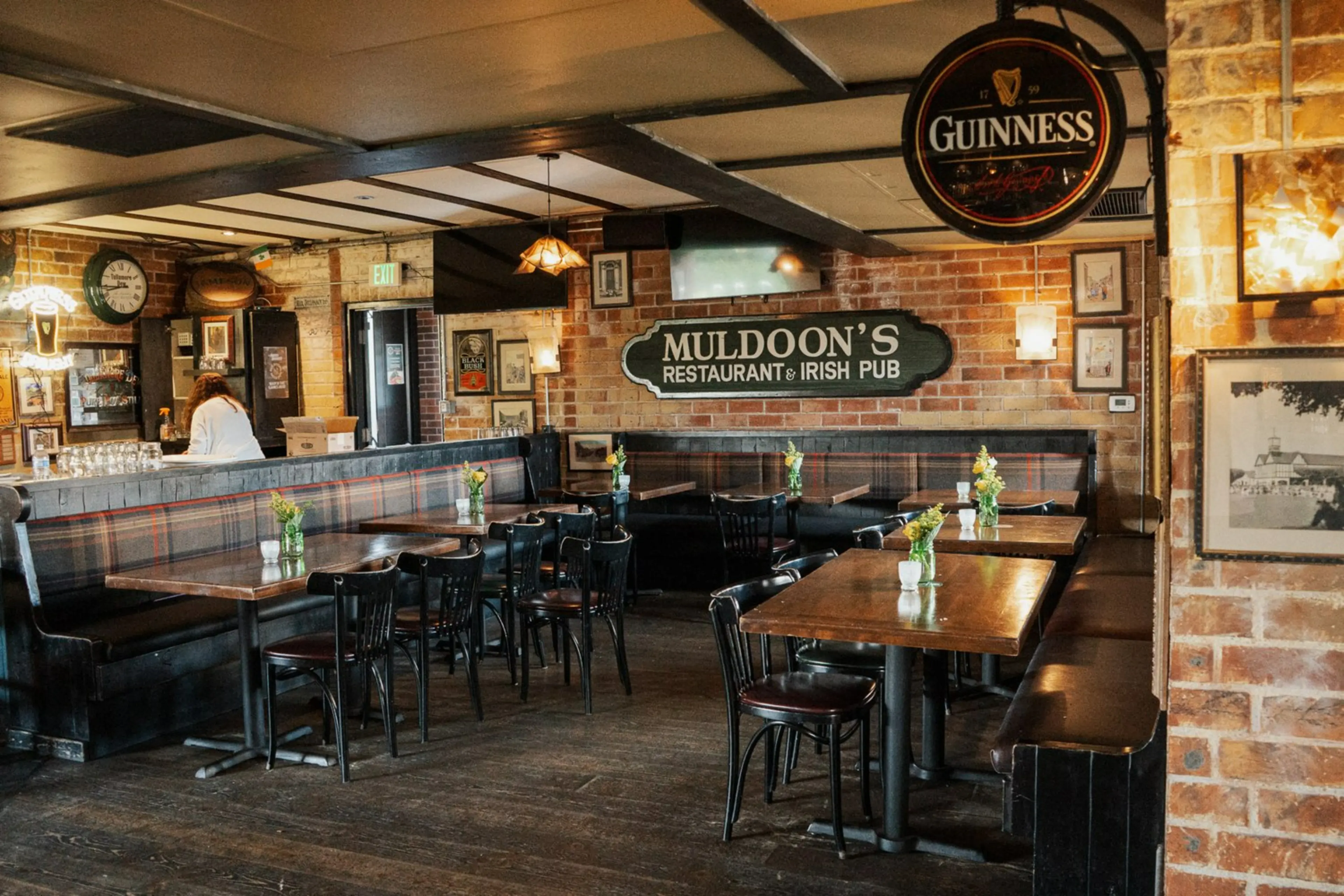
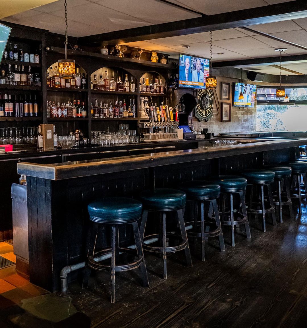
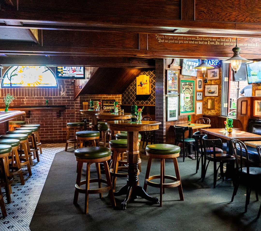
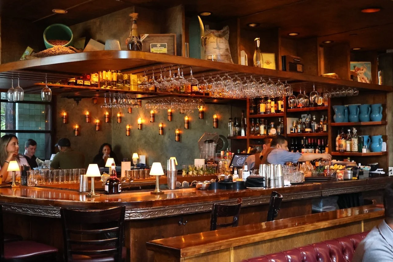
Muldoon's Irish Pub
Muldoon's Irish Pub is one of the Orange County restaurant environments where I have always felt comfortable, and I think that has a lot to do with how the space is organized.
The restaurant has several distinct areas: the brick courtyard, the dining room, and the bar spaces. Each one has its own emotional temperature. The courtyard feels open and relaxed. The dining room feels warm and traditional. The bar has the darker, more social energy you want from a pub. What makes it work is that these areas do not feel disconnected. They feel like different scenes inside the same world.
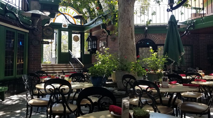
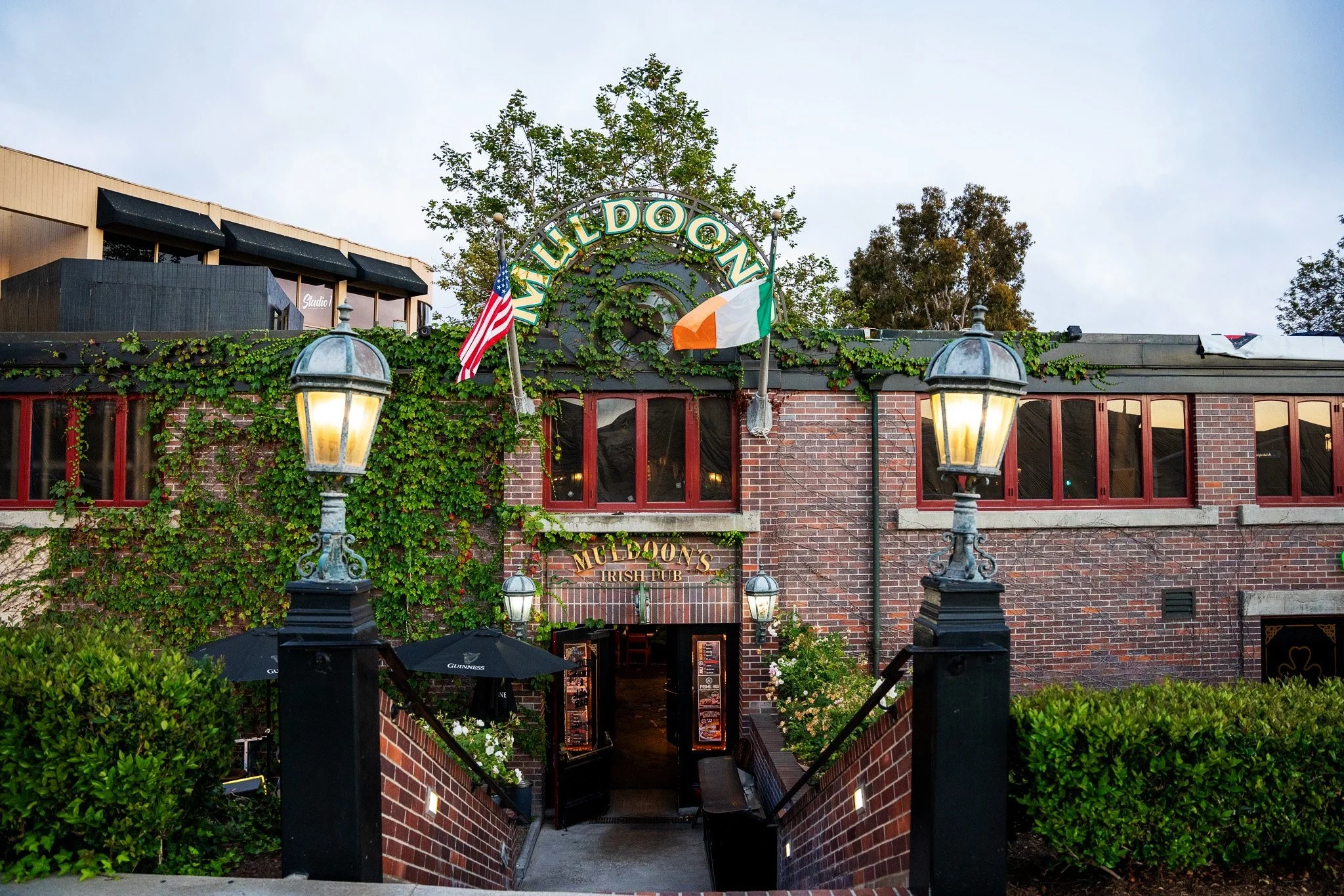
Muldoon's is not relying on one decorative gesture. It has a layout with variety. You can move from enclosure to openness, from daylight to shadow, from the more public energy of the bar to the softer comfort of the dining room. The courtyard gives the building a center, and the surrounding rooms feel like they are orbiting that shared atmosphere.
From a scenic design point of view, I appreciate that Muldoon's does not feel over-produced. It feels established. The brick, wood, stained glass, booths, fireplace, and courtyard all work together to create a sense of age and continuity. It feels like a place that has accumulated character instead of a place that was decorated all at once.
That is what I respond to most. The restaurant gives you choices of mood without losing its identity.
Design takeaway: Muldoon's works because of spatial variety. The courtyard, dining room, and bar each create a different feeling, but they still belong to the same environment.
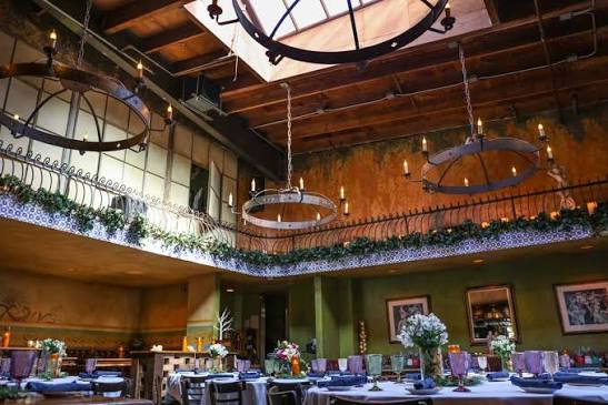
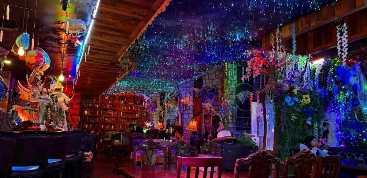
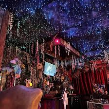
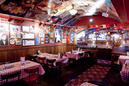
STOWAWAY
STOWAWAY is one of my favorite Orange County examples of themed escapism, especially when I want that kind of tiki atmosphere without making the trek to Disney.
Tiki design works when it feels layered. It needs density, shadow, texture, overhead detail, carved forms, warm light, collected objects, and a sense that the outside world has been intentionally shut out. It is not enough to hang a few tropical objects on the wall. A good tiki environment has to compress the room and make the guest feel like they have crossed into another kind of space.
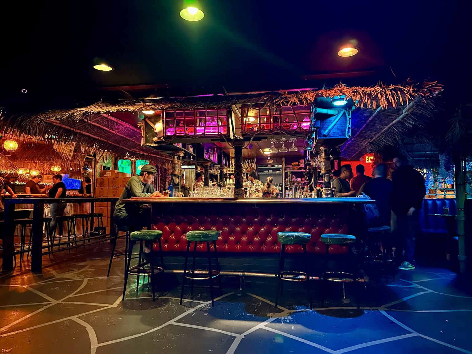
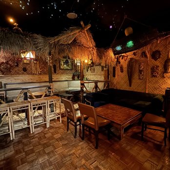
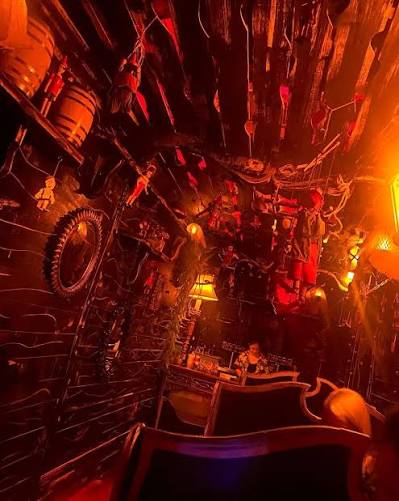
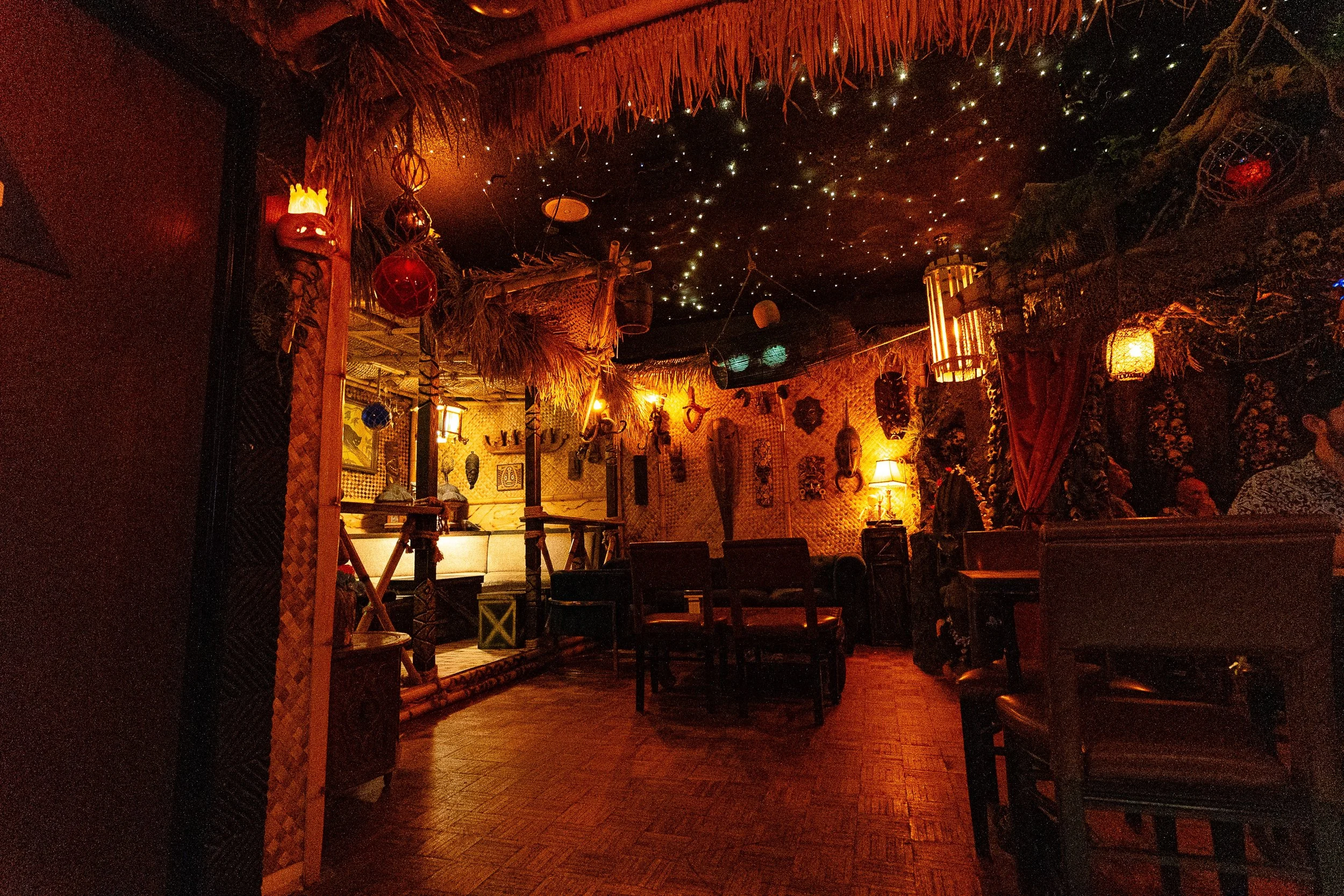
STOWAWAY feels theatrical because it understands that tiki is not simply tropical decoration. It is an atmosphere machine. The room needs to feel collected and slightly hidden. It needs to reward looking around. It needs to feel like there are layers beyond the first impression.
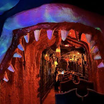
That is especially true with Belly of the Beast, the Pinocchio-inspired space inside STOWAWAY. A hidden entrance, a giant whale mouth, a smaller interior reveal - those are attraction moves. They create anticipation, threshold, and payoff. You are not just entering another bar. You are crossing into a story pocket.
STOWAWAY works for me because it gives the guest discovery. It has the main tiki environment, but then it rewards curiosity with a more specific themed layer inside it. That kind of nested experience is memorable.
Design takeaway: STOWAWAY succeeds through compression, texture, lighting, and reveal. It understands that tiki is not just a visual style; it is a fully built mood.
Great Maple
Great Maple is a different kind of environment from the others on this list.
It is not heavily themed in the way STOWAWAY or Elixir Wizard Academy are. It is not trying to make you feel like you have stepped into a fantasy world. But it still has a clear aesthetic identity, and that is why it stayed with me.
The way I remember Great Maple is Midwestern and upscale. Not Midwestern in a literal historical sense, but emotionally. It feels warm, polished, sturdy, and familiar. It has the comfort of an American dining room, but with enough finish and control to feel elevated.
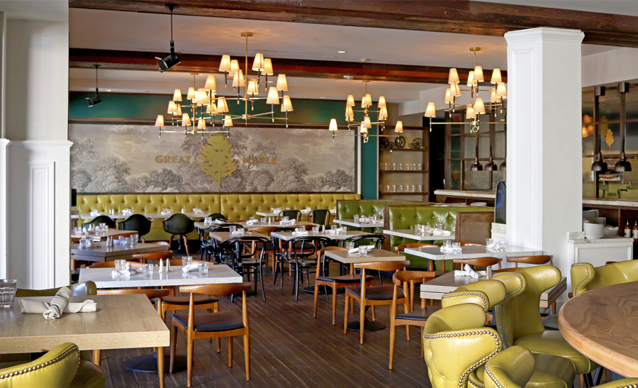
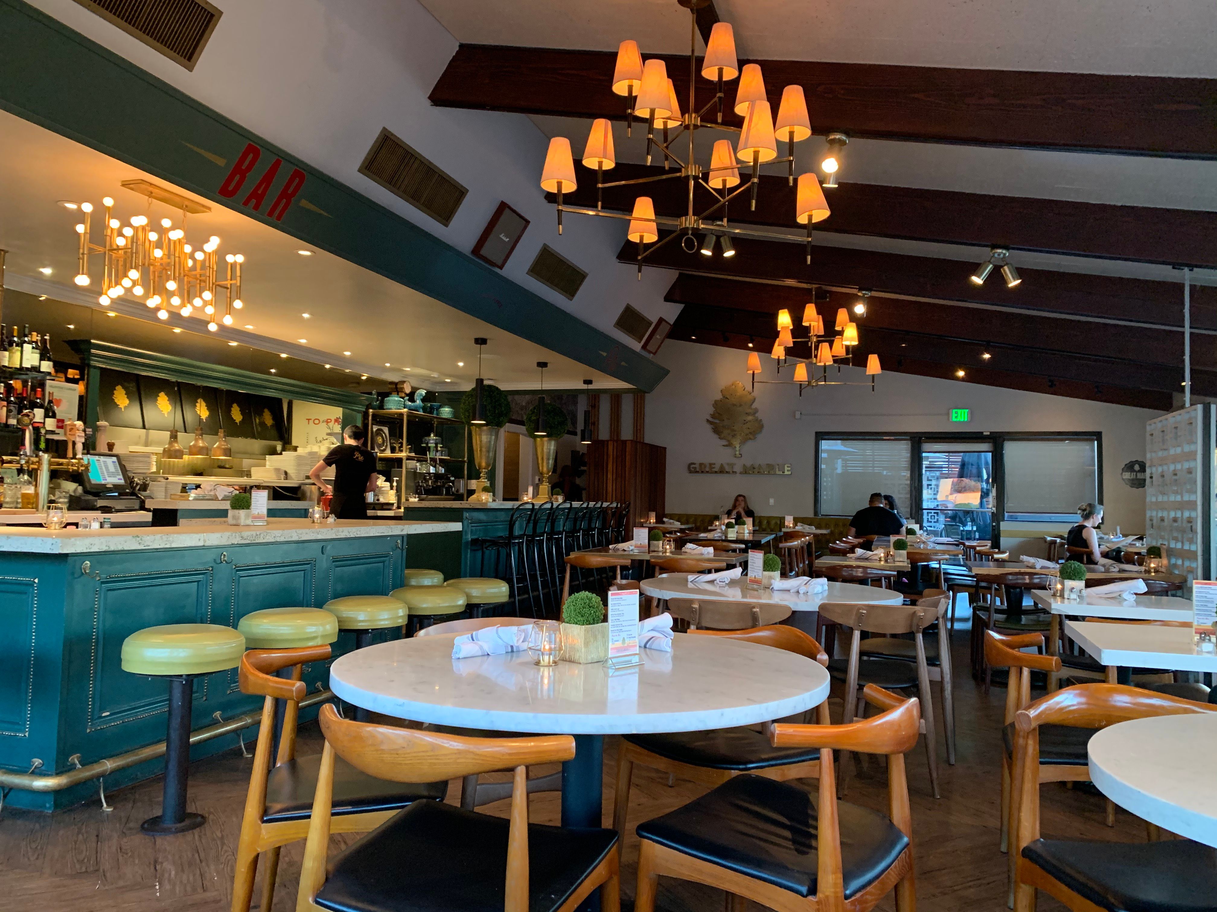
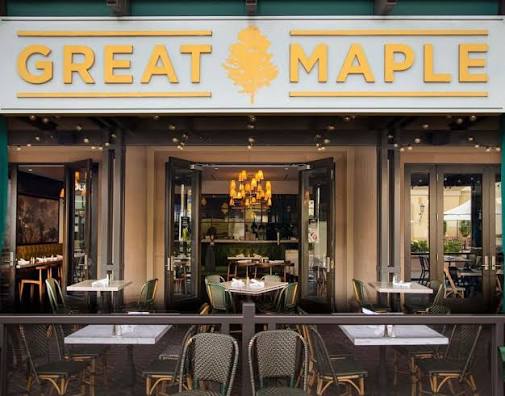
Great Maple is a softer kind of world-building. The environment is not asking you to play along with a story. It is setting a tone: bright, composed, social, and comfortable.
What I appreciate about Great Maple is restraint. Some restaurant environments impress through abundance. Great Maple works through editing. It feels designed, but not overworked. Upscale, but not cold. Comfortable, but not casual in a disposable way.
That balance is harder than it looks. If the design gets too polished, it can become sterile. If it gets too relaxed, it loses its sense of occasion. Great Maple sits in the middle, and that middle ground is part of its identity.
Design takeaway: Great Maple shows that atmosphere does not always require heavy theming. Sometimes a strong point of view is built through restraint, proportion, warmth, and tone.
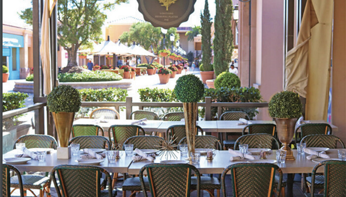
Habana
Habana is one of the strongest atmospheric restaurant environments I experienced while living in Orange County.
It has a romantic quality that feels immediately intentional. The lighting, color, planting, texture, patio atmosphere, and vintage references all work together to create a sense of removal from the everyday. It feels like a place designed for evening, conversation, and mood.
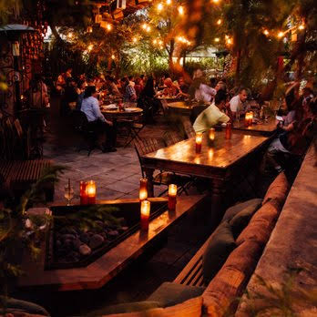
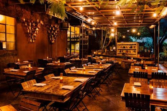
Habana builds toward an emotional idea: warmth, nightlife, nostalgia, music, glamour, and tropical density. It is not just using Cuban-inspired visuals as surface decoration. The environment feels central to the experience.
What I appreciate is that the atmosphere comes through accumulation. It is not one big scenic moment. It is the layering of light, plants, furniture, pattern, color, and sound. The room has a temperature. It feels lush. It feels cinematic. It feels like the environment is a major part of why you are there.
Habana also understands that romance is a design choice. Low light, warm tones, layered textures, and controlled density can make a room feel intimate even when it is busy. That kind of atmosphere does not happen accidentally. It is designed through repetition and consistency.
For me, Habana is a good example of environmental storytelling without needing a literal narrative. There is no single plot to follow, but the room still tells you where you are supposed to be emotionally.
Design takeaway: Habana uses lighting, texture, planting, and nostalgia to create transportive atmosphere. It is less about spectacle and more about mood.
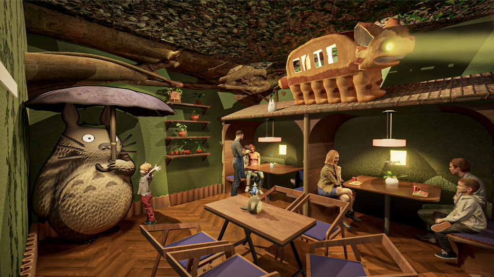
Elixir Wizard Academy
Elixir Wizard Academy impressed me more than I expected.
I went for a friend's birthday, and what stood out immediately was the level of commitment. It could have been a lightly decorated boba and ice cream spot with a few fantasy references, but it went further than that. It felt like someone wanted to create a small journey.
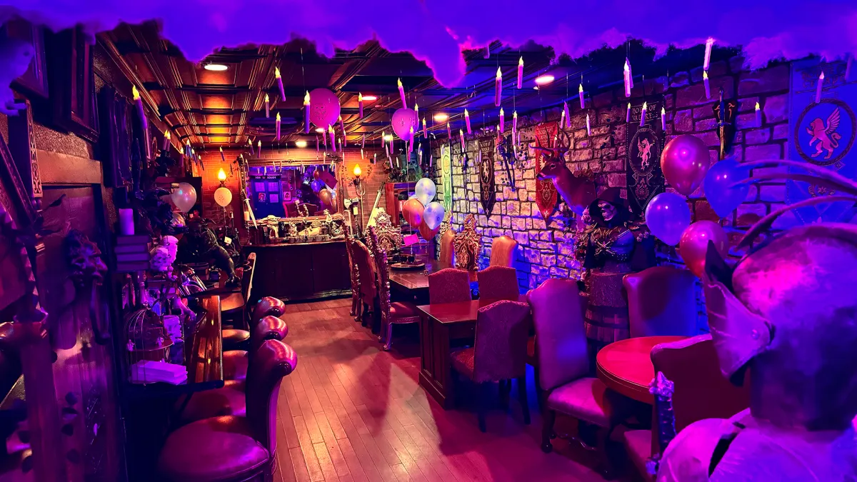
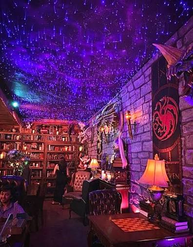
Elixir is interesting because the experience starts before the order. You climb, pass figures, move through themed cues, and arrive at the main space. In scenic terms, that is an arrival sequence. It gives the guest thresholds, reveals, and visual rewards before the central activity even begins.
That is where Elixir starts to feel connected to themed entertainment. It understands that the guest experience is not limited to the counter or the table. The approach matters. The stair matters. The props matter. The moment of discovery matters.
For a birthday, that kind of environment does a lot of work. It gives people something to react to. It gives the outing a sense of occasion. It turns a casual stop into something more memorable because the space allows the group to step into a shared fantasy for a while.
Elixir may not have the polish or budget of a major theme park environment, but that is not the point. What matters is the commitment. It believes in its own world enough for the guest to play along.
Design takeaway: Elixir Wizard Academy works because it treats the visit as a small narrative journey. The theming starts with arrival, not just decoration.
Honorable Mention: Buca di Beppo - Brea
Buca di Beppo deserves an honorable mention because it is a national chain, but I have always appreciated its maximalist set dressing.
The location that best fits the "near Fullerton" reference is the Brea location. My appreciation for Buca started before Orange County, though. I remember the same kind of visual overload from the Kansas City location: walls packed with images, rooms full of kitsch, and a sense that every surface had been assigned a job.
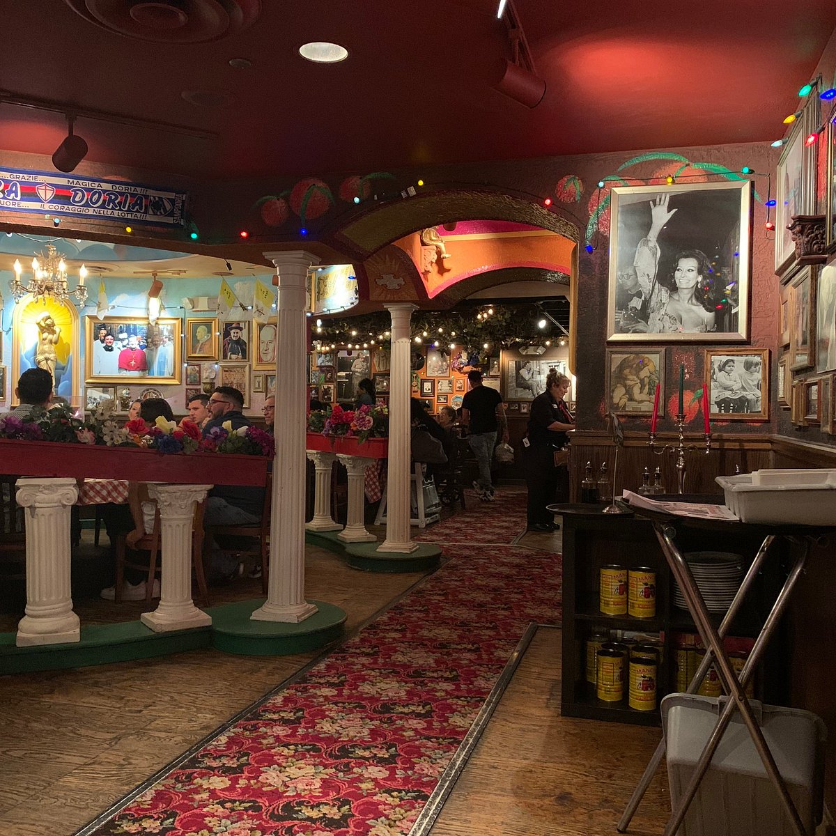
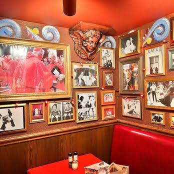
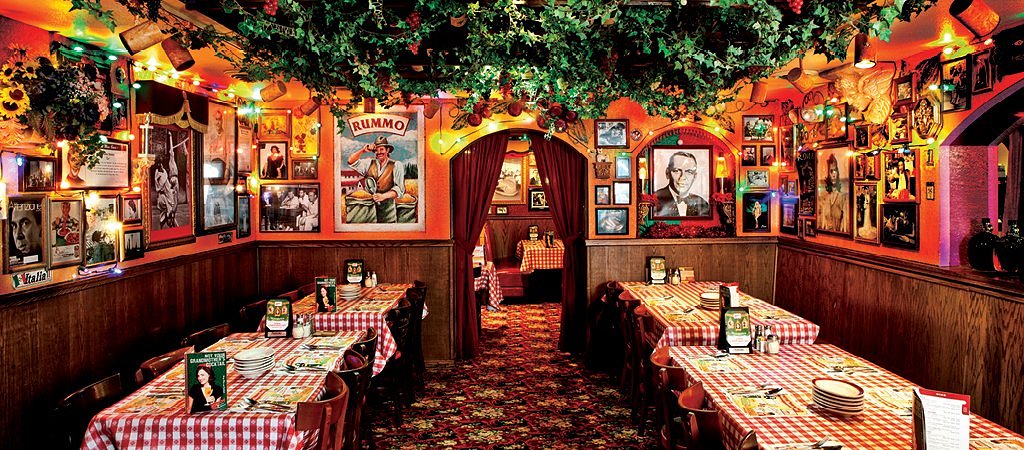
Even though it is a chain, I respect how committed Buca is to abundance. It is not subtle, and it is not trying to be. The walls are not just decorated; they are overloaded on purpose. The photos, visual jokes, themed rooms, and nostalgic clutter create a kind of theatrical collage.
From a scenic perspective, I respect that. Buca understands set dressing as identity. It creates a room where the guest is surrounded by information, and the density becomes part of the experience.
It is not one of the five main environments for me because it is a national chain, but as an example of maximalist restaurant set dressing, it absolutely belongs in the conversation.
Design takeaway: Buca di Beppo shows how maximalism can become a brand environment. Its visual overload is not a flaw; it is the design strategy.
Closing Thoughts
The restaurant environments I remember most are not always the newest, most expensive, or hardest to get into. Sometimes they are the places that simply know what they are trying to make you feel.
Muldoon's gives me spatial variety and pub comfort. STOWAWAY gives me tiki escapism and discovery. Great Maple gives me polished American warmth. Habana gives me romance and atmosphere. Elixir Wizard Academy gives me fantasy-world commitment in an accessible form.
I wish I had made it to more places while I was living in Irvine. Orange County has no shortage of designed environments, and I know there are restaurants I missed. But these are the ones that stayed with me because they were reachable, repeatable, and memorable.
For me, good restaurant decor is not just about looking nice. It is about creating a place. It is about giving the guest a mood to enter, a world to sit inside, and a memory that lasts longer than the meal.
That is where atmosphere becomes attraction.