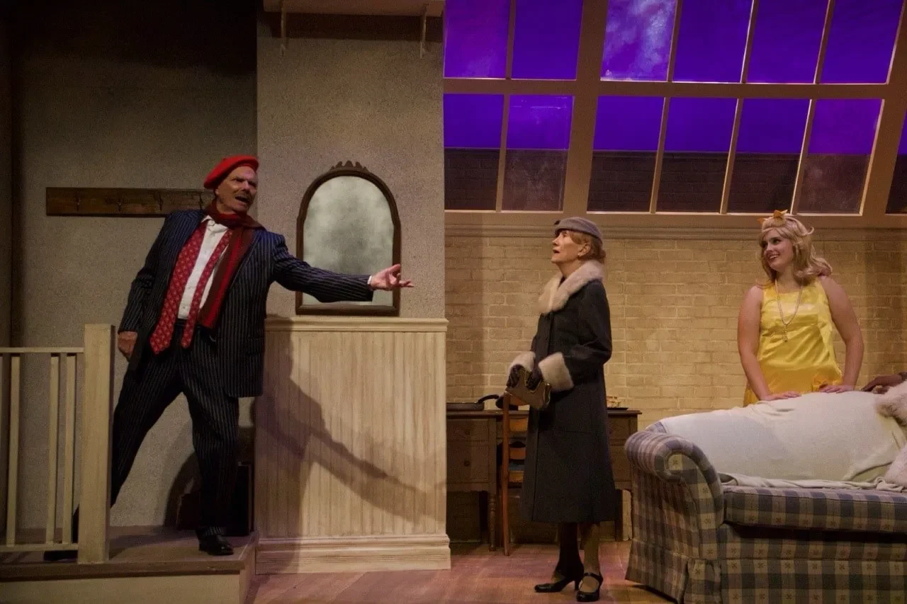
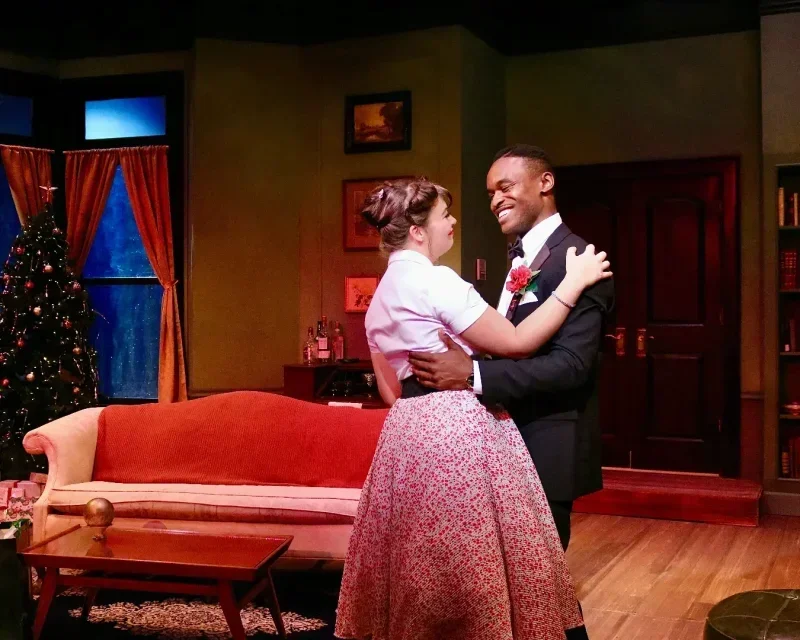
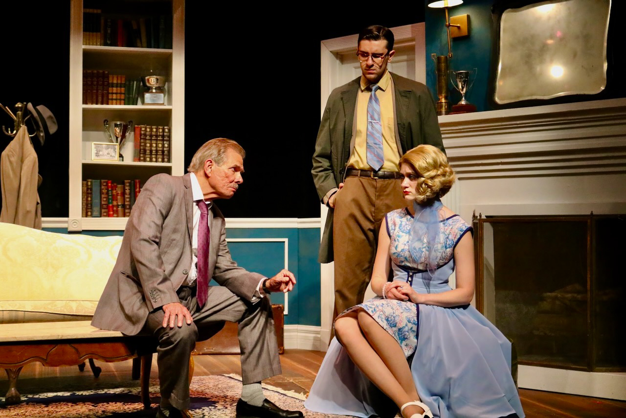
Barefoot in the Park
A compact New York walk-up whose scale, stairs, and thresholds turn Barefoot in the Park into a comedy of spatial pressure.

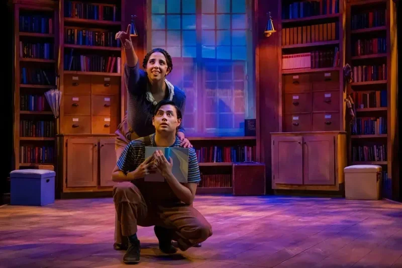
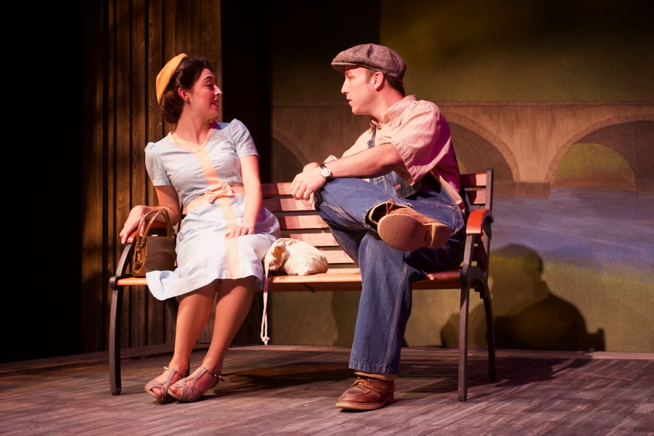
A New York Walk-Up
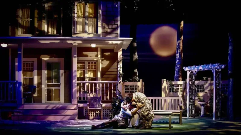
Barefoot in the Park works best when the apartment is charming and impossible at the same time. I treated the walk-up as a pressure cooker: too many stairs before the front door, too little insulation from the city, and just enough room for newlywed optimism to collide with practical reality.
Geometry for Comedy
The floor plan carries the comedy. Doors, windows, and the apartment's tight circulation give actors clean pathways for entrances and reversals, but the proportions keep everyone a little too close. That closeness is where the play finds its spark.
A Walk-Up with Pressure
The set lets the audience enjoy the apartment and question it at the same time. It is a love nest, a bad rental decision, and a comic obstacle course, which gives the relationship somewhere specific to grow up. The apartment stays funny because it is almost workable.
News, Reviews & Insights
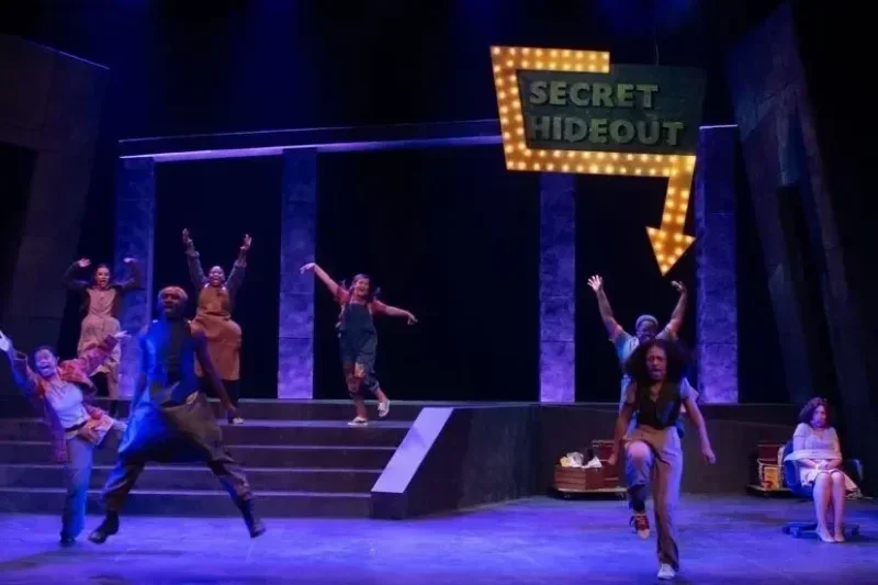
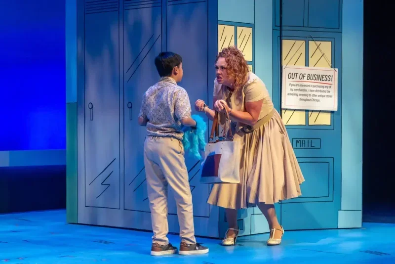
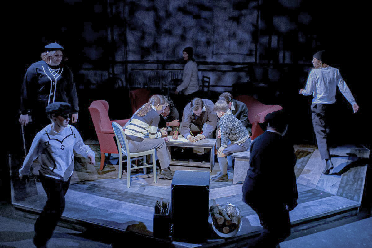
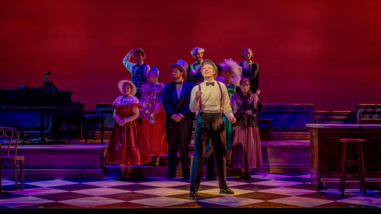
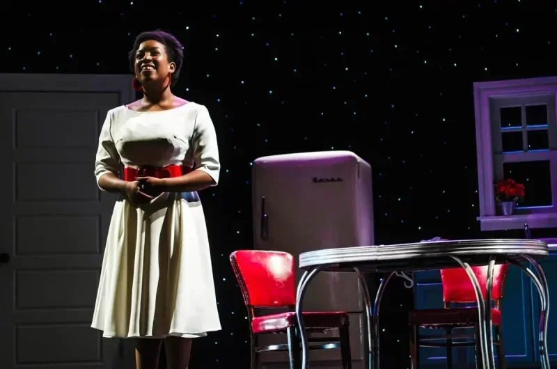
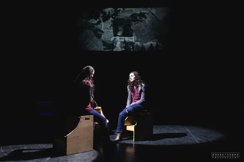
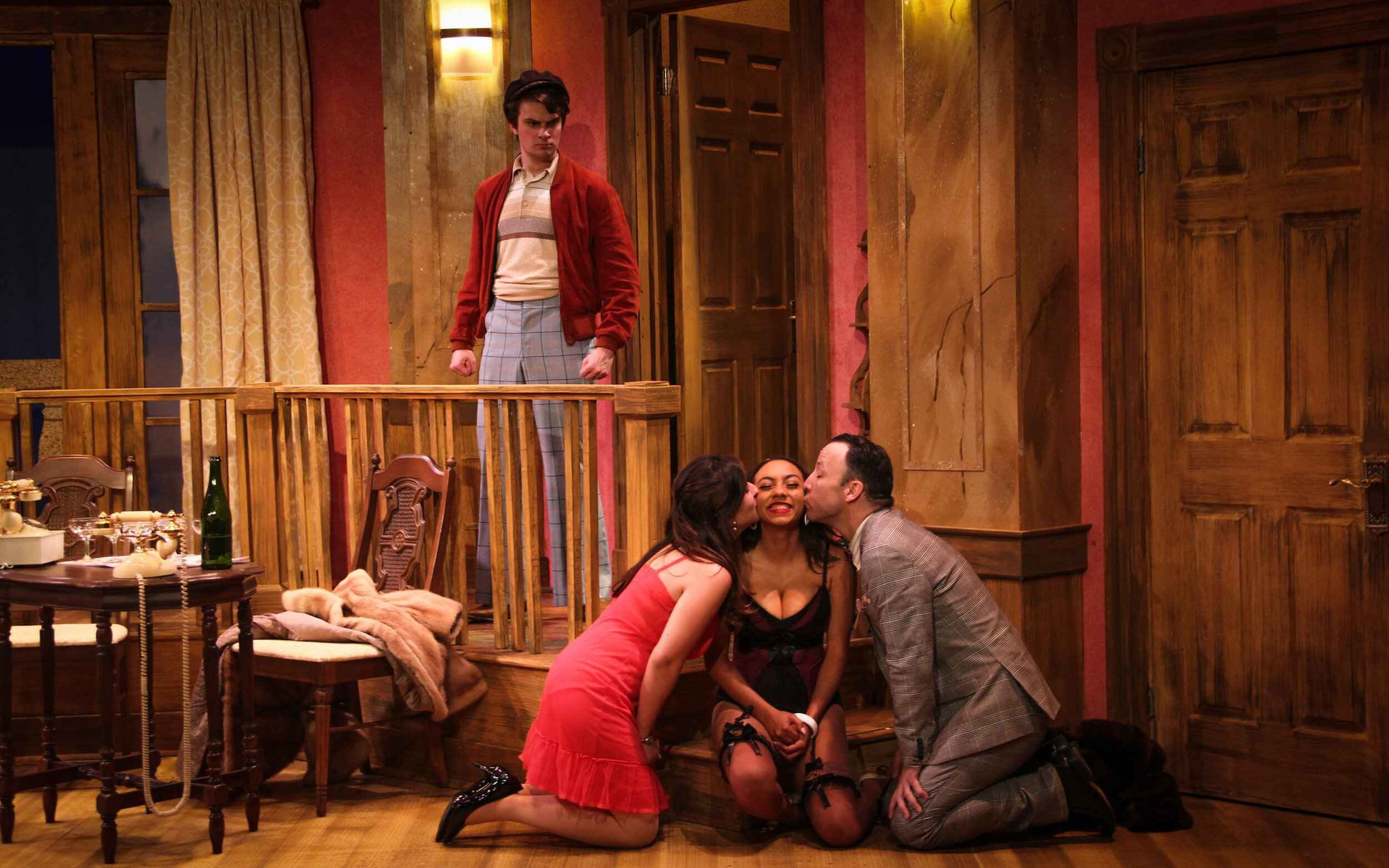
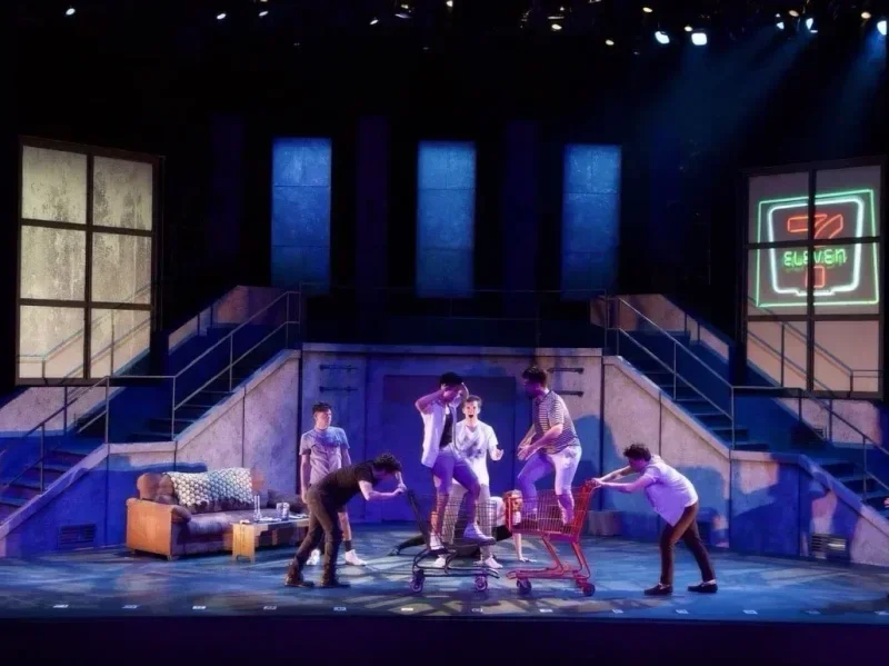
All Scenic Designs
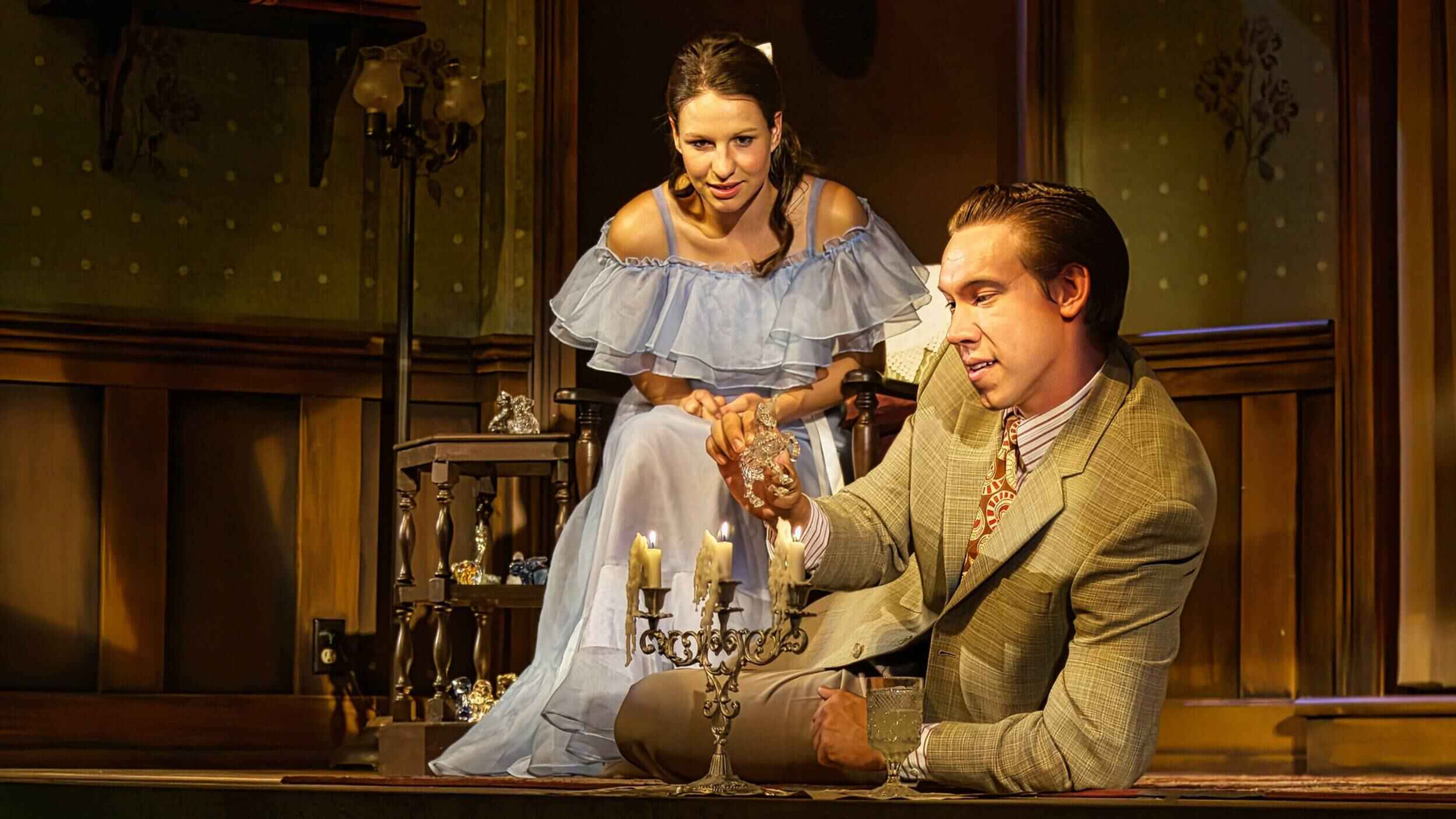
The Glass Menagerie
Maples Repertory Theatre 2025
Million Dollar Quartet
South Coast Repertory Theatre 2025
All's Well That Ends Well
New Swan Theatre Festival 2025
Bell, Book, and Candle
Okoboji Summer Theatre 2025
Much Ado About Nothing
New Swan Theatre Festival 2025
Guys on Ice
The Great American Melodrama 2025
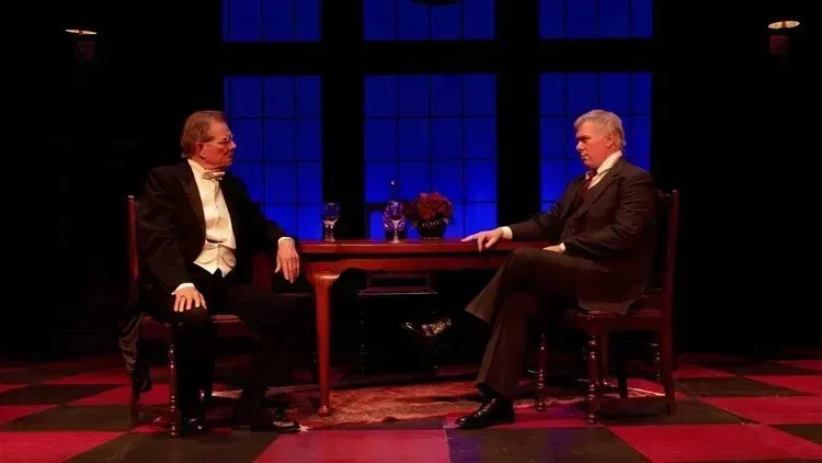
Romero
University of Missouri 2025
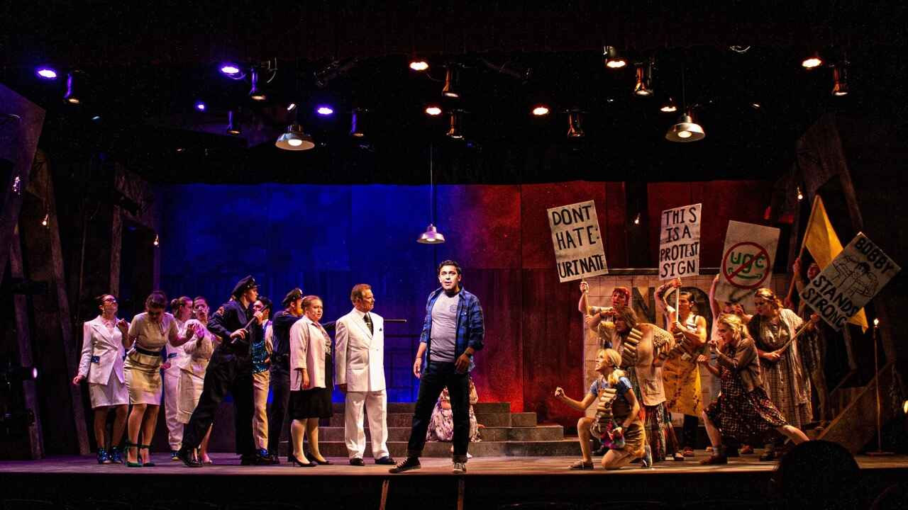
Urinetown
University of Missouri 2024
Freaky Friday
Okoboji Summer Theatre 2024
An Enemy of the People
Stephens College 2023
Dial “M” for Murder
Okoboji Summer Theatre 2023
Cole
Okoboji Summer Theatre 2023
Head Over Heels
Theatre SilCo 2023
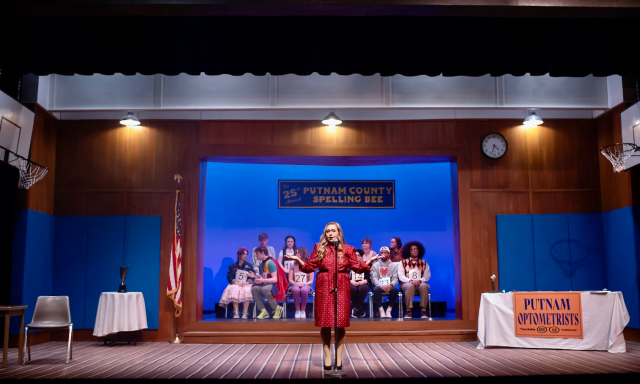
The 25th Annual Putnam County Spelling Bee
Stephens College 2023
¡LOTERIA: GAME ON!
Theatre SilCo 2023
Boeing, Boeing
Stephens College 2023
An Inspector Calls
Okoboji Summer Theatre 2022
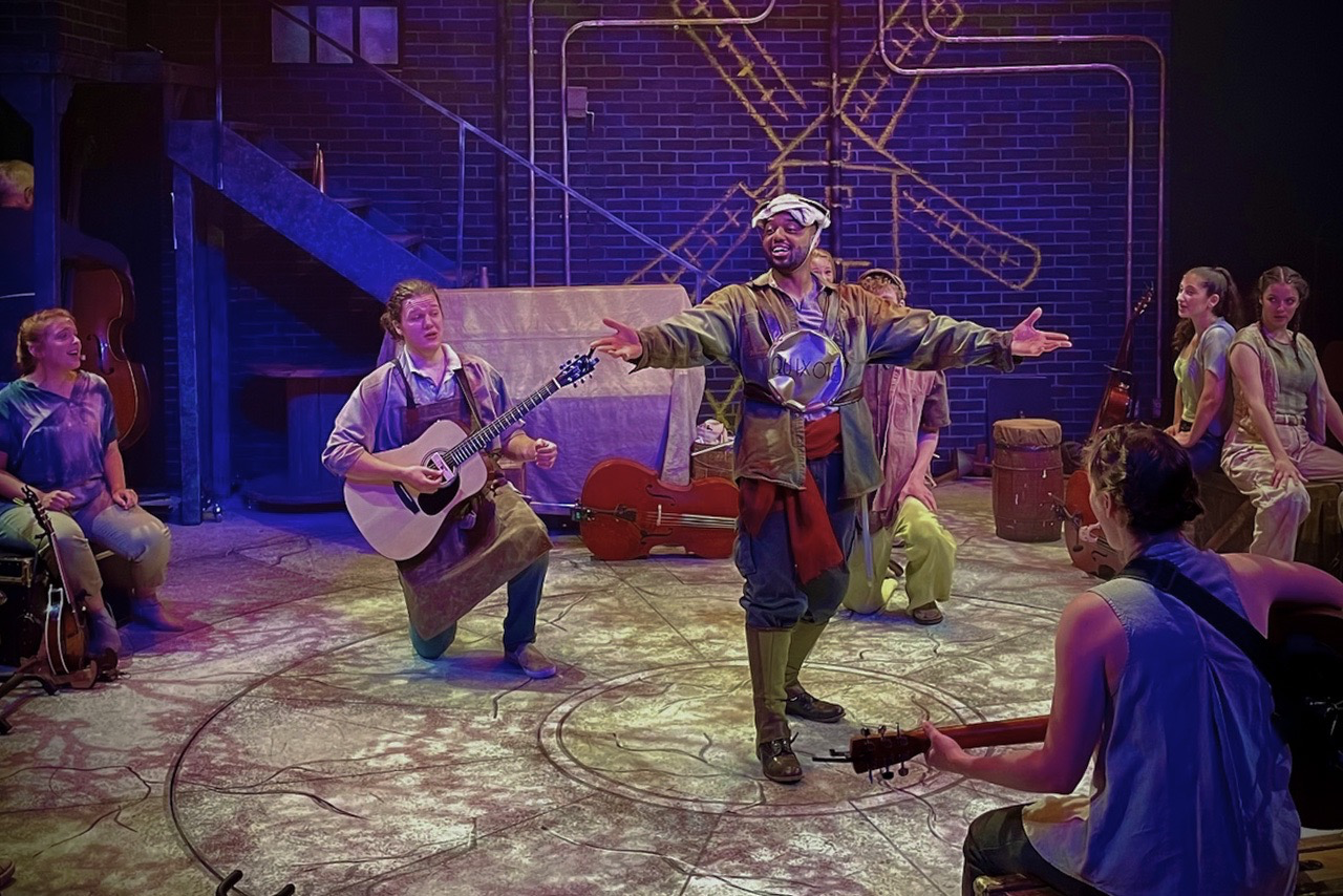
The Man of La Mancha
Lake Dillon Theatre Company 2022
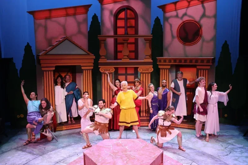
A Funny Thing Happened on the Way to the Forum
Lake Dillon Theatre Company 2022
Tomás and the Library Lady
Lake Dillon Theatre Company 2022
The Merry Wives of Windsor
Stephens College 2022
The Bald Soprano
Stephens College 2022
A Smalltowne Christmas
Stephens College 2021
Urinetown
Okoboji Summer Theatre 2021
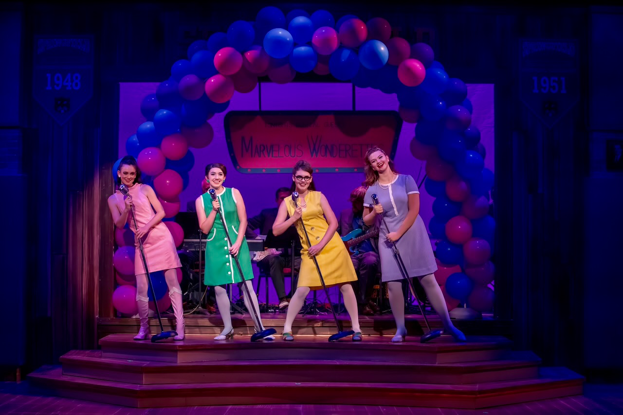
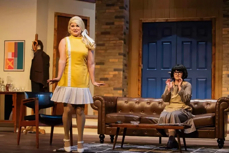
The Marvelous Wonderettes: Dream On
Okoboji Summer Theatre 2021
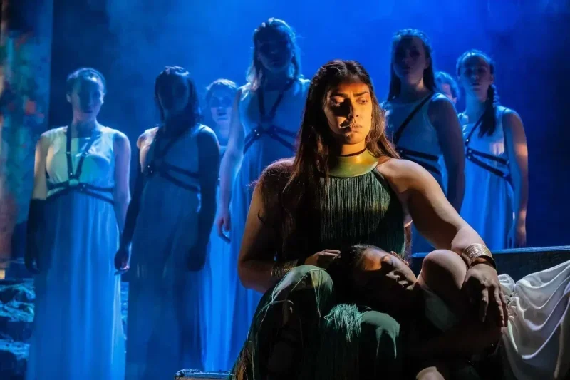
The Penelopiad
University of California Irvine 2020
Company
University of California Irvine 2019
The Pajama Game
University of California Irvine 2019
Parliament Square
University of California Irvine 2019
Not Now, Darling
Okoboji Summer Theatre 2018
American Idiot
University of California Irvine 2018
Last Train to Nibroc
Okoboji Summer Theatre 2016
Vanya and Sonia and Masha and Spike
Stephens College 2016
Little Shop of Horrors
Okoboji Summer Theatre 2014
Rich Girl
Okoboji Summer Theatre 2014
The Complete Works of William Shakespeare (abridged)
Okoboji Summer Theatre 2014
Angel Street
Okoboji Summer Theatre 2013

Bingo: The Winning Musical
Okoboji Summer Theatre 2013
Don't Dress for Dinner
Okoboji Summer Theatre 2013
The Liar
Okoboji Summer Theatre 2012
The Glass Menagerie
Okoboji Summer Theatre 2011
All My Sons
Stephens College 2010
The Effect of Gamma Rays on Man-in-the-Moon Marigolds
Okoboji Summer Theatre 2010