
Studio / Vectorworks Studio
Scenic Drafting Graphics
An illustrated guide to line weights, line types, scenic symbols, dimensions, and material hatches.
Each illustrated reference has a full-size plate link.
These basic drafting conventions were developed from USITT drafting standards. Use the illustrations to understand how a scenic drawing communicates form, position, movement, and construction.
The Scenic Design Template applies this graphic language in Vectorworks. For project organization, layers, and references, see Vectorworks setup and file standards.
Line weights
Width carries priority. Line weight is the thickness of a line. Use it to distinguish the information a reader needs first: cut profiles and dominant edges, visible form, surface detail, and supporting annotation. A drawing with one weight makes every edge compete equally.
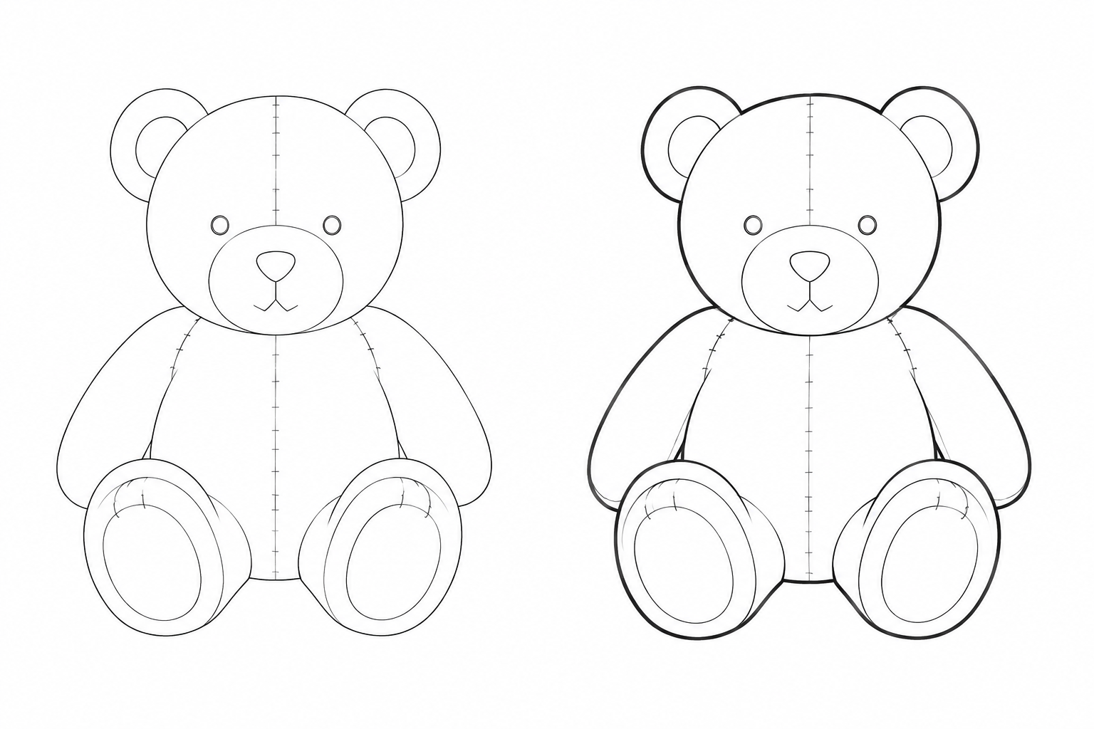
The comparison from the drafting guide: the subject stays the same; a heavy silhouette, medium overlaps, and light interior detail establish depth and priority.
Read the hierarchy
| Graphic role | What it communicates |
|---|---|
| Dominant / cut | Profiles cut in plan or section, cutting planes, borders, and dominant spatial edges |
| Primary / visible | Visible edges, intersections of planes, and the main outline of the object |
| Secondary / detail | Changes in material, color, or texture that do not change the form |
| Supporting / annotation | Dimensions, extension lines, leaders, hatches, surface texture, and organizing lines |
The heaviest line advances first. Lighter lines remain legible without competing with the object. Use enough contrast to make the hierarchy visible at the drawing’s issued size and scale.
Apply it in the Scenic Design Template
The template uses its own named Graphics classes and pen settings. These are the digital settings shown in the template, rather than the pencil widths in the hand-drafting reference below.
| Graphics class | Pen thickness |
|---|---|
| 1. Light | 0.18 mm |
| 2. Medium | 0.35 mm |
| 3. Heavy | 0.50 mm |
| 4. Extra Heavy | 0.70 mm |
| 5. Section Line | 0.50 mm |
| Line-pattern classes | 0.18 mm |
Use class attributes to apply the settings consistently. Choose the weight for the information the line carries, then inspect a PDF or print at the issued scale. Screen zoom alone cannot tell you how the line will reproduce.
Hand-drafting reference
The hand-drafting guide establishes four teaching weights. They describe the same hierarchy, but their numbers and names are a separate reference from the Vectorworks template.
| Teaching weight | Width | Use |
|---|---|---|
| Heavy | 0.9 mm | Plan and section cut profiles, cutting planes, plate borders, dominant spatial edges |
| Medium | 0.7 mm | Visible edges and intersections of planes; primary outlines |
| Light | 0.5 mm | Changes in material, color, or texture; secondary visible information |
| Very light | 0.3 mm | Layout lines, dimensions, extensions, leaders, hatches, and surface texture |
Keep pencil density uniform, use a steady stroke, and meet corners crisply. Change width to establish priority. Test the drawing at its final reproduction size before issuing it.
Line types
Read meaning, then weight. A solid, dashed, chained, or break line identifies the condition being shown. Weight establishes its priority. An overhead object, a hidden edge, and an alternate position each need a recognizable pattern.
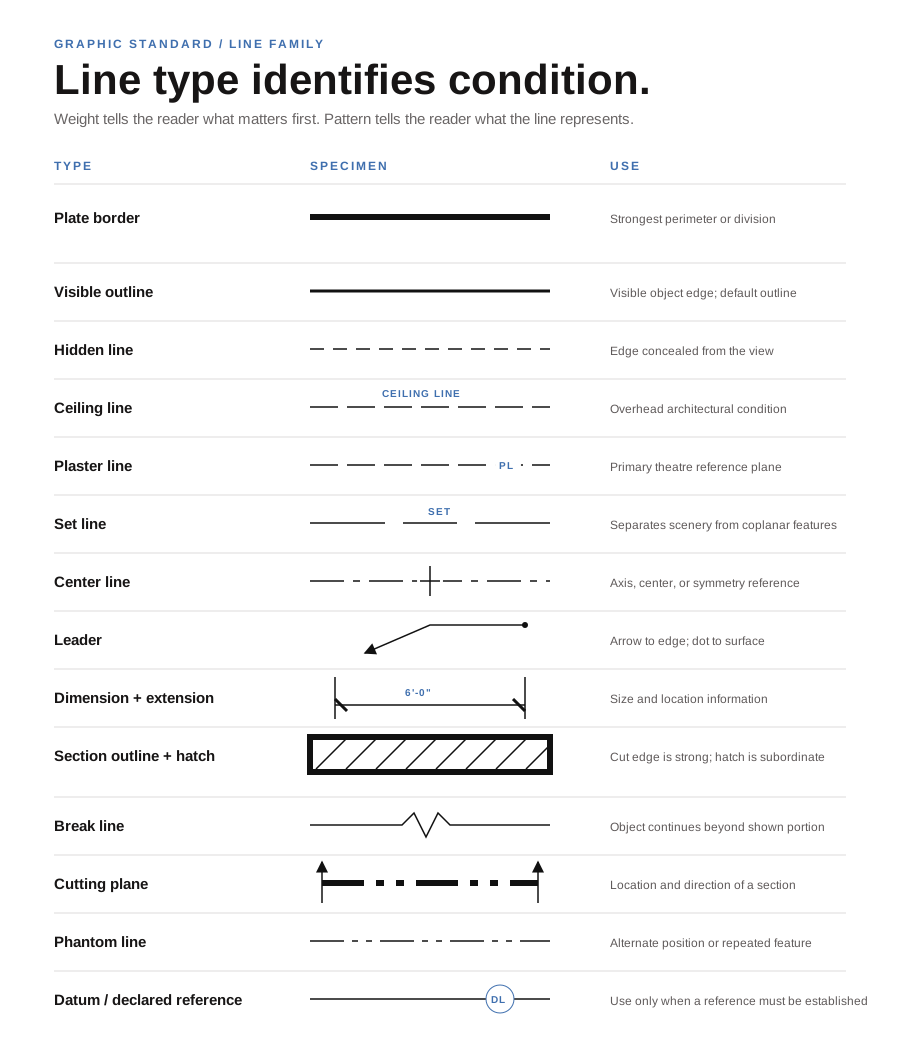
Reference plate from the drafting guide. Line forms redrawn from the 1992 USITT plate for clarity.
Open the full-size line-type plate
Use center and plaster lines as named stage references. A cutting plane identifies where a section is taken and the direction of view. A break line shows that the object continues beyond the part drawn. Define a project-specific reference in the legend so readers know what it means.
Scenic symbols
A symbol communicates a condition at drawing scale. The heavy line describes the scenic object; thinner added geometry explains the joint, opening, panel position, or movement. Standard symbols give the reader a shared language. Define variations when the conventional mark does not describe the design clearly.
Flats and openings
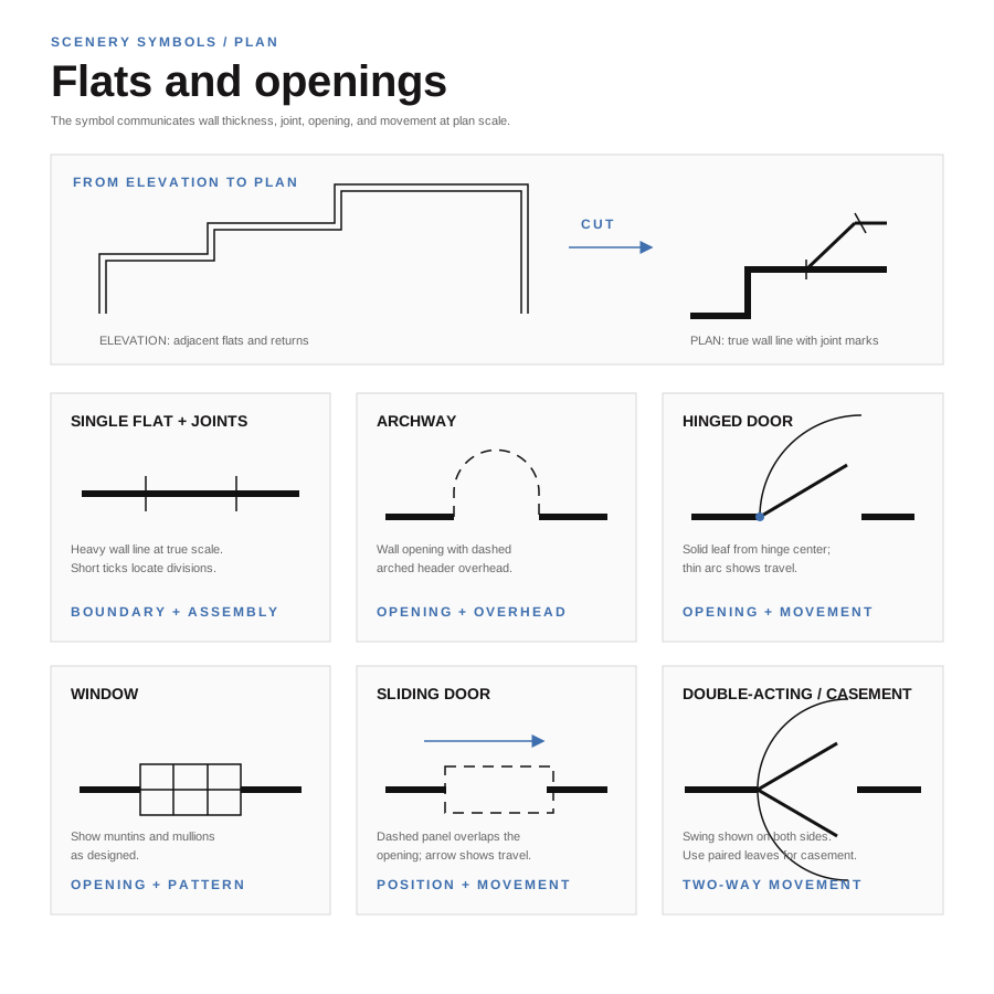
Plan conventions from the drafting guide, redrawn from the 1992 USITT symbols.
Open the full-size flats and openings plate
Show the flat at its true thickness and locate joints with the appropriate marks. For a hinged door, show the leaf from the hinge center and use a thin swing arc to describe travel. A sliding panel needs its position and direction of movement. Show window divisions as designed.
Levels and soft goods
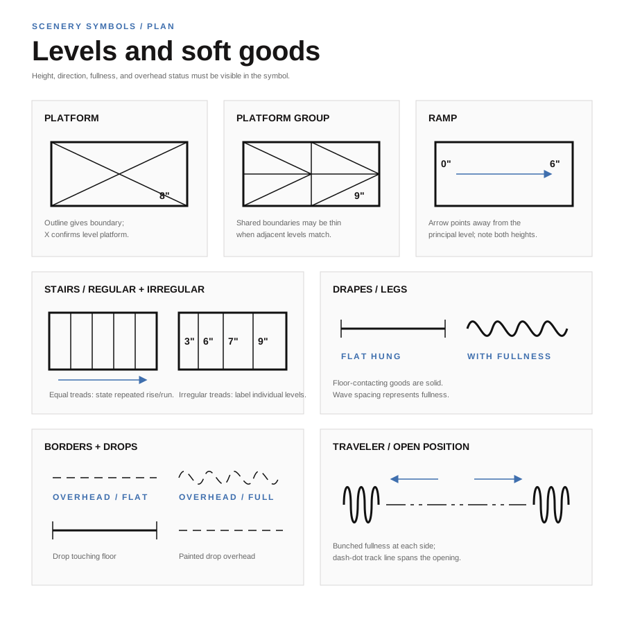
Numbers communicate height; patterns distinguish fullness, movement, and overhead conditions.
Open the full-size levels and soft goods plate
Label platform heights and changes in level. For irregular stairs, identify the individual levels rather than making the reader infer them. Distinguish floor-contacting soft goods from overhead goods, and use the drawn fullness to explain how fabric is hung. Keep the plan and section descriptions coordinated.
Hardware symbols
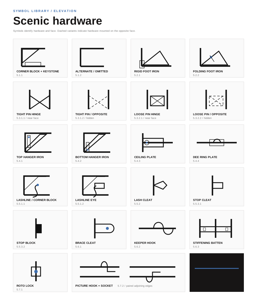
Solid variants indicate the near face; dashed variants indicate the opposite face.
Open the full-size hardware plate
Place the hardware symbol where the hardware occurs in the assembly. Add a note or detail when its size, orientation, or attachment cannot be understood from the symbol. Define variations in the drawing legend.
Dimensions and notation
State size and location. The drawing should not force the reader to calculate missing information. Put overall dimensions outside smaller strings, locate centers, and use a consistent system of text, ticks, arrows, and leaders.
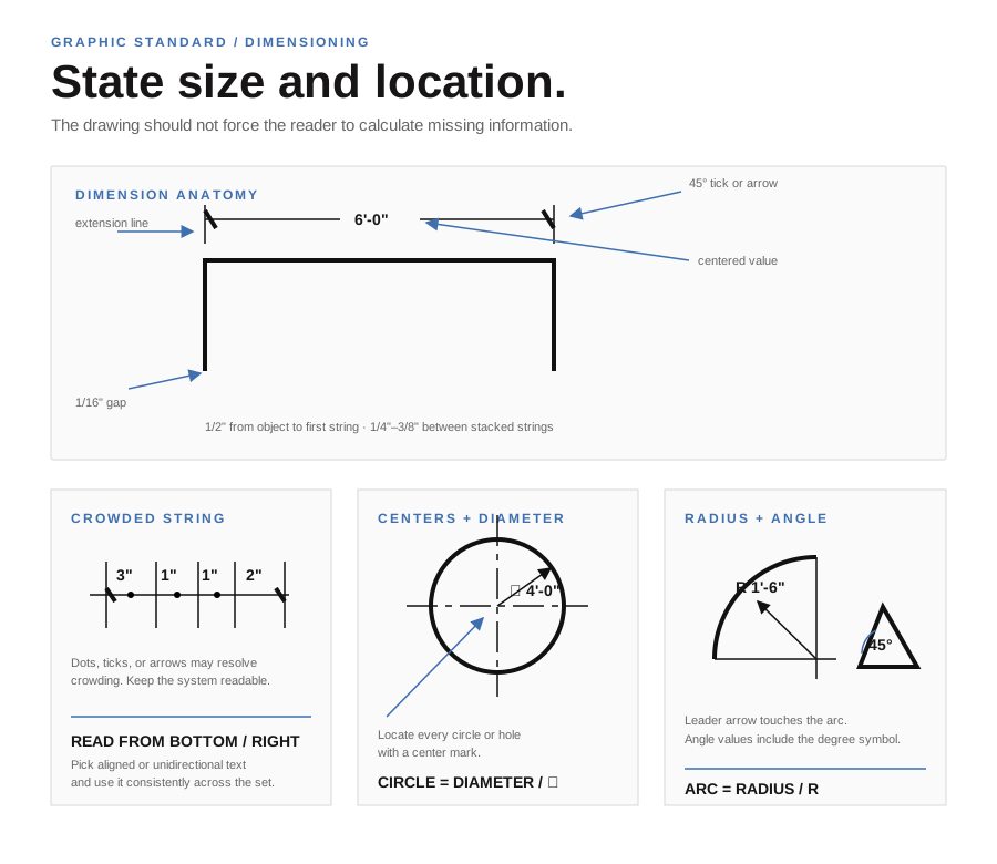
Open the full-size dimensioning plate
Use diameter for circles, radius for arcs, and the degree symbol for angles. Dimension from named references such as stage floor, centerline, plasterline, or an explicitly established project reference.
Lettering that reads clearly
Simple letterforms, consistent height, and clear spacing make notes legible after reduction. For hand drafting, the guide uses single-stroke Gothic capitals. In digital drawings, preserve that clarity with consistent text styles and plotted sizes.
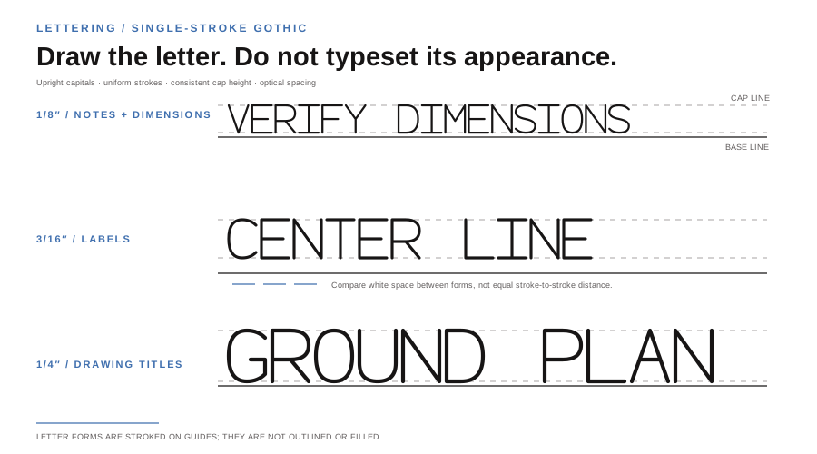
Open the full-size lettering plate
Sections and hatches
Outline first. Hatch second. The section outline carries shape and priority. Hatch identifies the material cut by the section without overpowering the outline.
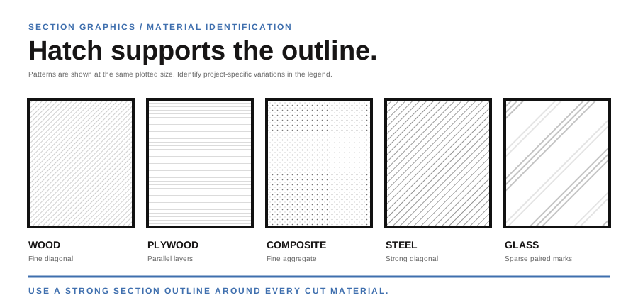
Open the full-size material hatch plate
Draw the cut profile first. Keep the marks inside it thin and even, change hatch direction where adjacent pieces meet, and identify project-specific patterns in the legend. If a layer is too thin to hatch clearly, show it solid and identify it with a note. Check that the pattern remains open at the final printed size.