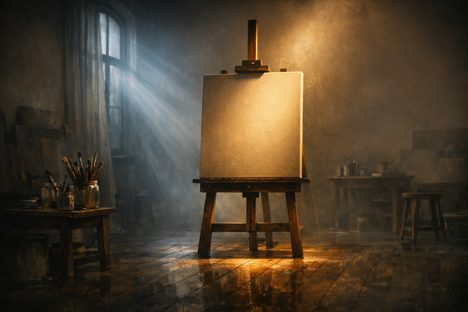
A strong scenic rendering is not judged only by beauty. It succeeds when directors, shops, and collaborators can read the image quickly and make better decisions because the visual hierarchy is clear.
Before we get into lighting styles or textures, let’s talk about the software that supports this work: Vectorworks.
Vectorworks: A Tool for Storytelling and Precision
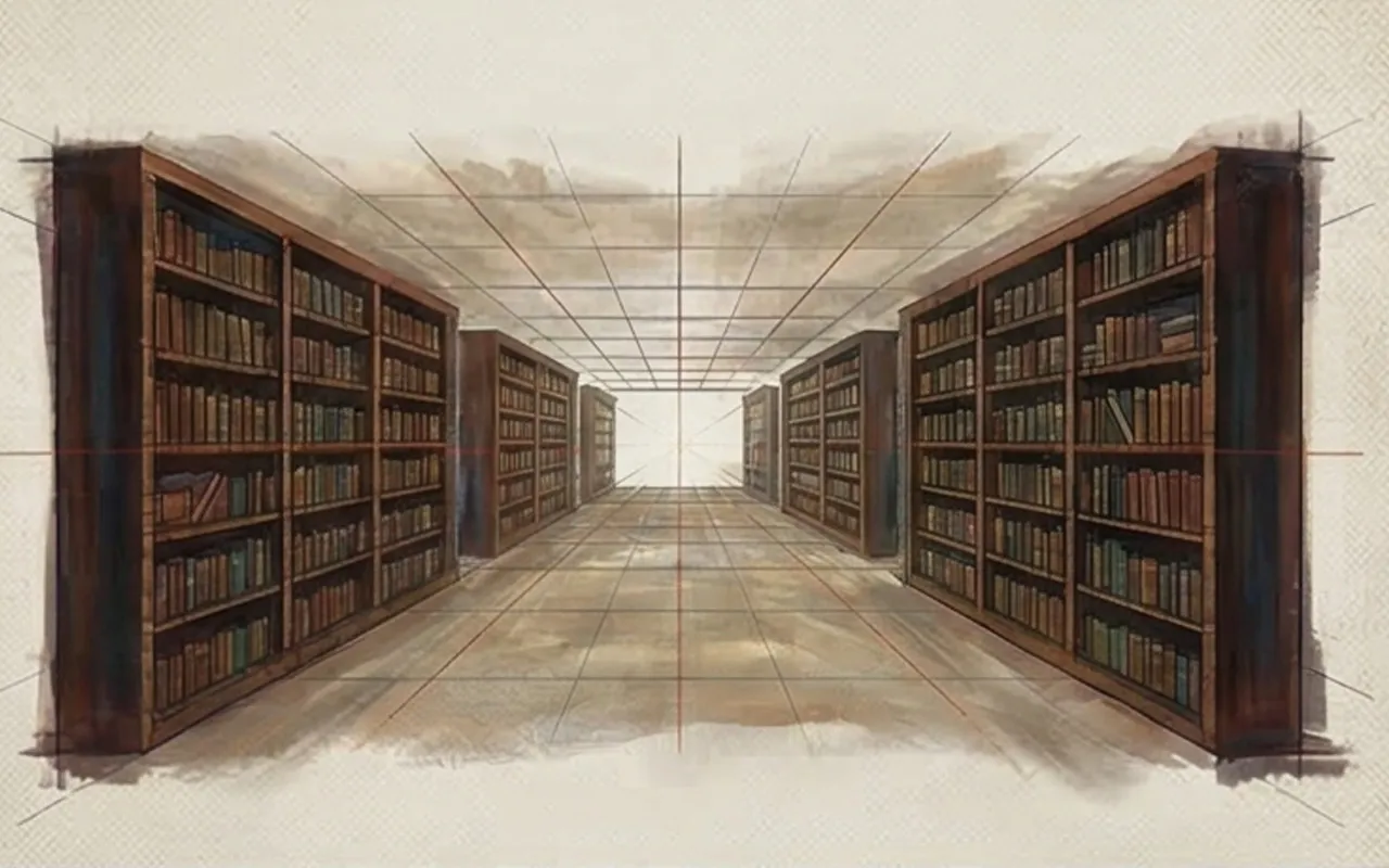
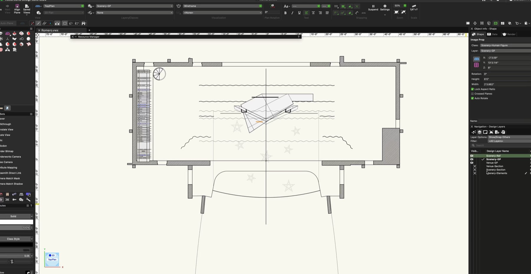
Vectorworks serves a dual purpose: it's a drafting/documentation tool and a 3D rendering engine. Its strength lies in accuracy—you can build from the plan up with real-world scale and dimensional clarity. That precision makes it ideal for scenic design, where collaboration with technical directors and production teams is constant.
Unlike mesh-heavy software, Vectorworks models stay clean, geometric, and readable, especially for beginners. While it isn’t optimized for organic modeling, it creates a solid foundation for scenic work that needs to communicate both art and feasibility.
I use Vectorworks because it keeps the technical side as strong as the artistic side—and that balance matters.
Lessons from Fine Art: Rendering as Visual Storytelling
To teach what makes a rendering successful, I often turn not to software—but to painting. In a recent lecture, I led students through examples by Caravaggio, De La Tour, Rembrandt, and Hopper. These artists didn’t just paint spaces. They crafted moments.
Their tools were oil and canvas. Ours are digital. But the goals are identical: guide the eye, evoke emotion, and give clarity.
Georges de La Tour – The Penitent Magdalene
Georges de La Tour was a seventeenth-century French Baroque painter known for quiet interiors lit by a single candle or lamp. Unlike painters who built drama through movement, La Tour often built it through stillness. The result is contemplative rather than loud.
That matters for scenic rendering because many designers assume impact has to come from complexity. La Tour shows the opposite. A restrained image can feel emotionally rich if the light source is specific and the atmosphere is controlled.
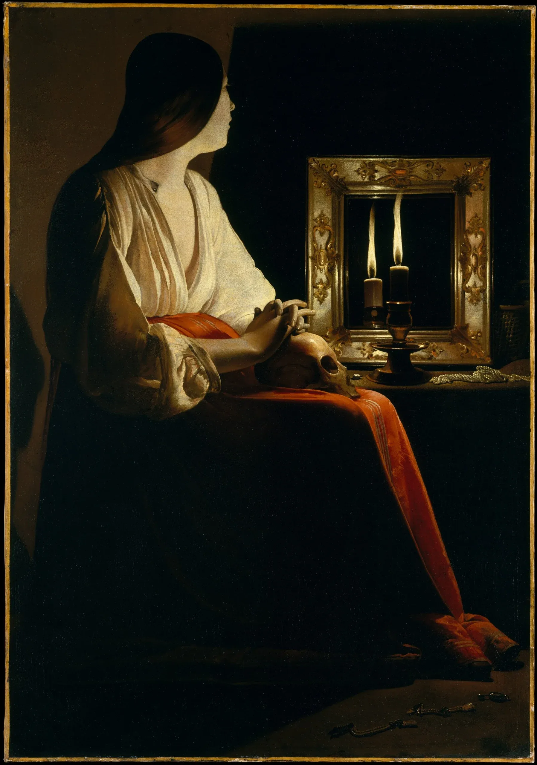
- Focus: Atmospheric Lighting
- Takeaway: A single light source creates emotional tone and spatial clarity.
- Rendering Insight: Less is often more. Lighting should support story, not just visibility.
Caravaggio – The Calling of Saint Matthew
Caravaggio worked in Rome at the turn of the seventeenth century, and his paintings are often taught through the lens of chiaroscuro: the use of intense contrast between light and dark. But what makes his work useful for scenic designers is not just contrast. It is staging.
His figures feel arranged with purpose, as if the painting already understands blocking, cueing, and audience focus. In a rendering, that kind of compositional decisiveness helps an image communicate before anyone reads the design notes.
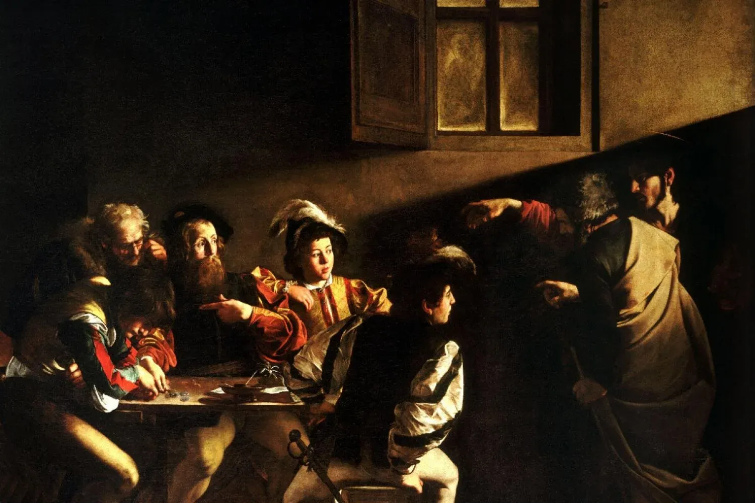
- Focus: Focal Point & Composition
- Takeaway: Diagonals, light direction, and body placement tell the whole story.
- Rendering Insight: Stage your scene. Guide the eye intentionally.
Rembrandt – The Night Watch
Rembrandt’s The Night Watch is often discussed as a group portrait, but it behaves more like a lesson in hierarchy. Not every figure is given the same emphasis. Light, gesture, and placement determine who matters first and who supports the composition from the edges.
That principle is essential in rendering. Scenic images often fail when they try to describe everything evenly. Rembrandt reminds us that clarity comes from choosing what deserves attention and allowing the rest of the world to recede.
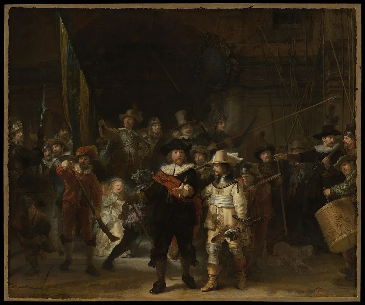
- Focus: Visual Hierarchy
- Takeaway: Use light to highlight important figures, and shadow to let others recede.
- Rendering Insight: Complex spaces still need clarity. Prioritize depth.
Edward Hopper – Nighthawks
Edward Hopper is a twentieth-century American painter whose work is often associated with urban loneliness, distance, and psychological atmosphere. In Nighthawks, the architecture does as much emotional work as the figures. Glass, light, and empty street space frame the human isolation inside the diner.
For scenic rendering, Hopper is a useful reminder that mood does not have to come from spectacle. It can come from spacing, framing, and what is withheld. Sometimes the most powerful part of an image is the world implied just outside it.
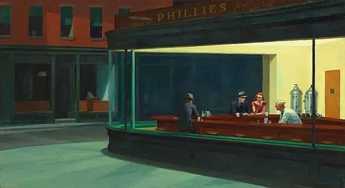
- Focus: Architectural Framing & Mood
- Takeaway: Emotion comes from silence, spacing, and negative space.
- Rendering Insight: What’s outside the rendering matters too. Suggest a world beyond the walls.
The Core Elements of a Good Scenic Rendering
1. Story Comes First
A rendering without story is just a diagram. Before it sells a space, it should feel like a moment. Whether it's tension, warmth, anticipation, or emptiness, your rendering should communicate something even if the viewer doesn’t know the play, script, or event yet.
If your image doesn’t evoke an emotional cue, then no amount of detail will matter.
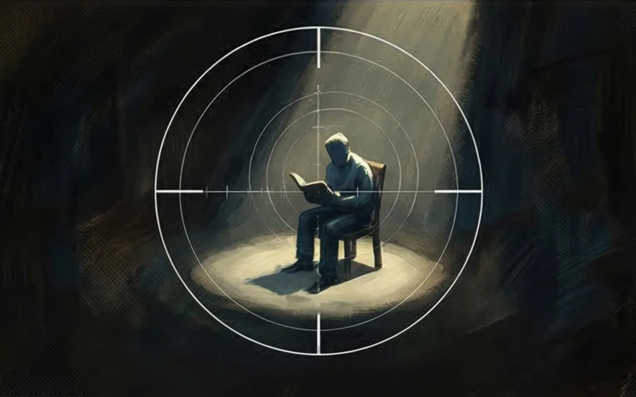
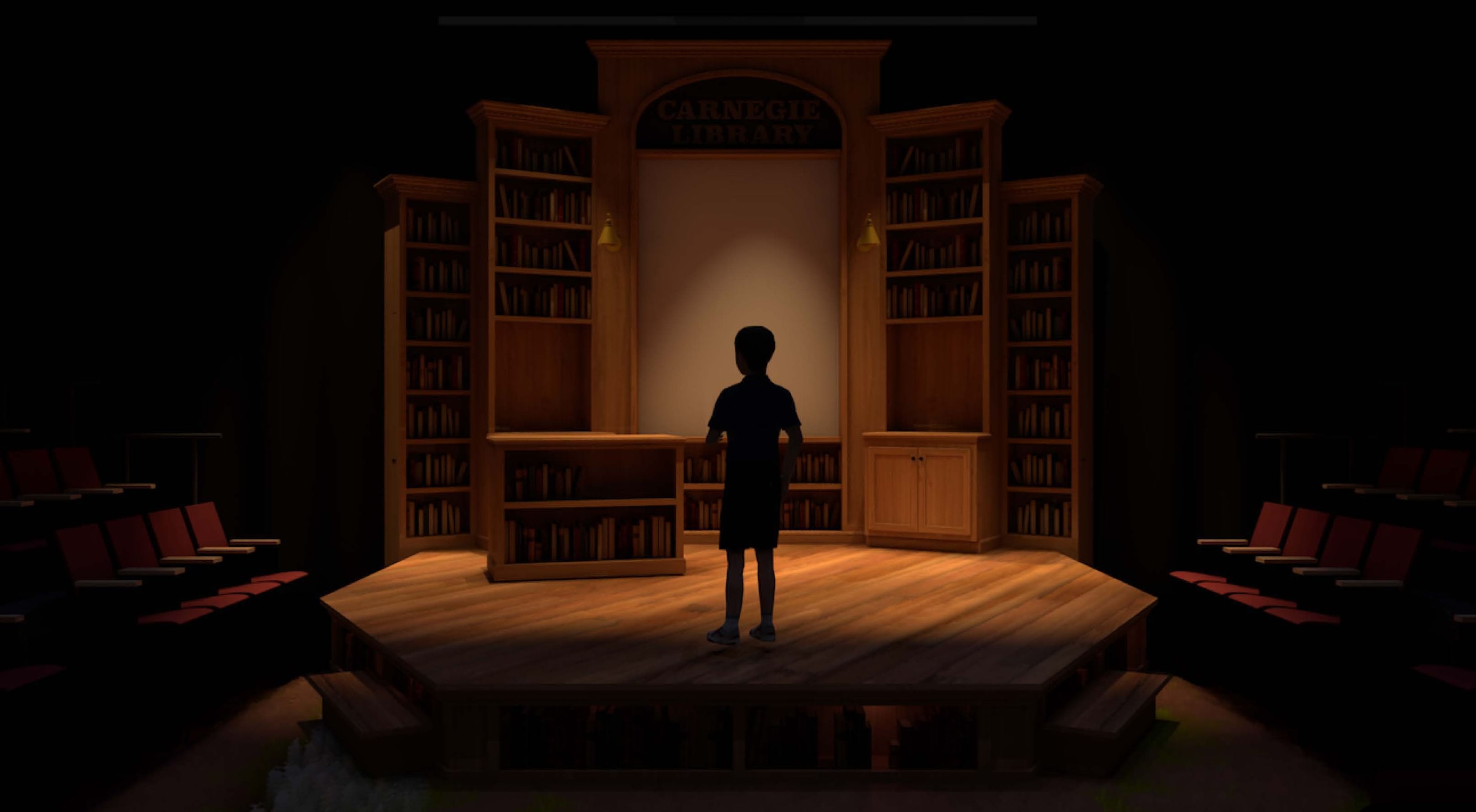
2. Human Figures
People seek connection with people.
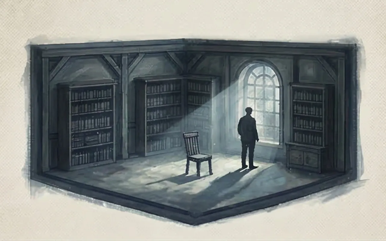
We are hardwired to seek out other people. That’s why we look at faces in crowds, pause at silhouettes, or follow the gesture of a figure in an image.
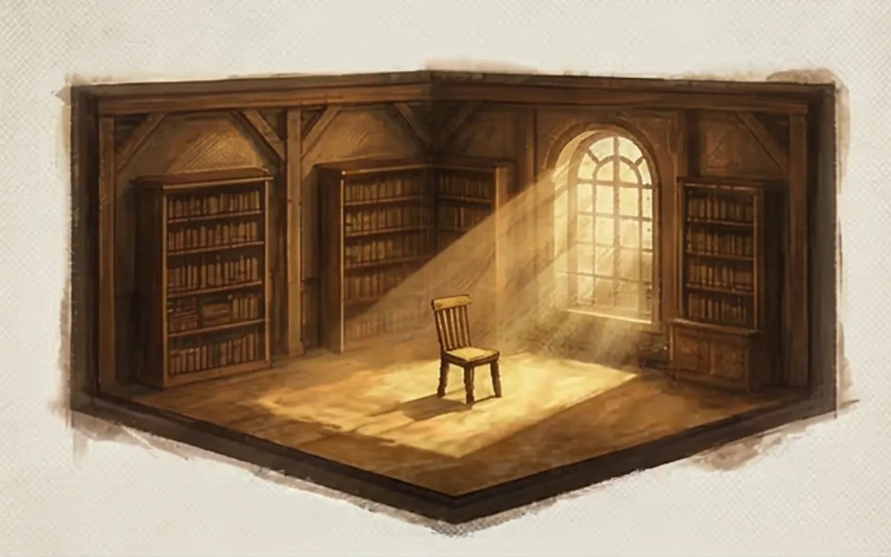
In scenic rendering, figures aren’t just placeholders—they’re emotional touchstones. They let the viewer place themselves in the world. They scale the space, yes—but more importantly, they activate it. A single figure looking out a window can do more storytelling than any object on a shelf.
This is what makes a space feel inhabited, even in stillness.
3. Composition Directs the Eye
Just like a director blocks a scene, the designer blocks a frame. Where the eye lands, where it travels next—those are choices.
A strong composition tells the viewer how to look at the world you're creating. It's rhythm, framing, and spatial relationships. Composition isn’t a background element. It’s an invisible script, guiding attention, revealing story, and holding emotion in place.
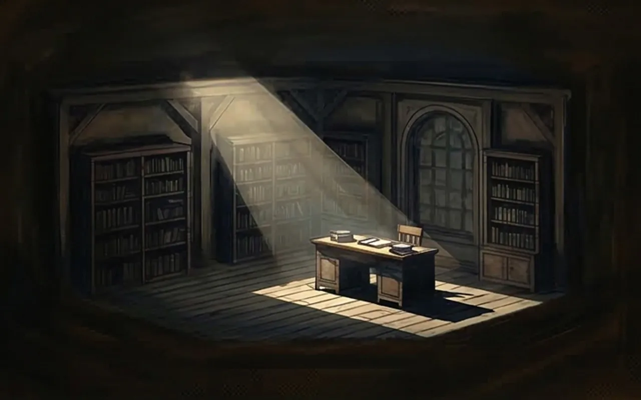
4. Lighting is the Invisible Narrator
Light is the design element we feel before we process. It tells us time of day, source, temperature—and more importantly, it tells us how to feel about what we’re seeing.
Lighting creates depth, defines form, and focuses attention. A shaft of light can suggest revelation. A shadow can imply danger.
Think of lighting as scenic storytelling in motion, frozen in time.
5. Color Communicates Instantly
Before we read space, we read tone. Warm tones imply safety, nostalgia, or intimacy. Cool tones may suggest isolation, control, or modernity. Highly saturated colors feel heightened, theatrical. Muted colors can suggest realism or restraint.
Your palette does more than decorate—it sets expectations. It’s emotional shorthand. Use it to reinforce genre, story, and atmosphere, not just aesthetics.
6. Focal Points = Visual Priorities
The eye needs a place to land. And once it lands, it needs a reason to stay.
In a scenic rendering, focal points aren’t just about clarity—they’re about intention. Whether it’s a figure under a pool of light, a glowing portal, or a single object in an empty room, your focal point should be where the story concentrates.
Every scenic image should have visual hierarchy. If everything is emphasized, nothing is understood.
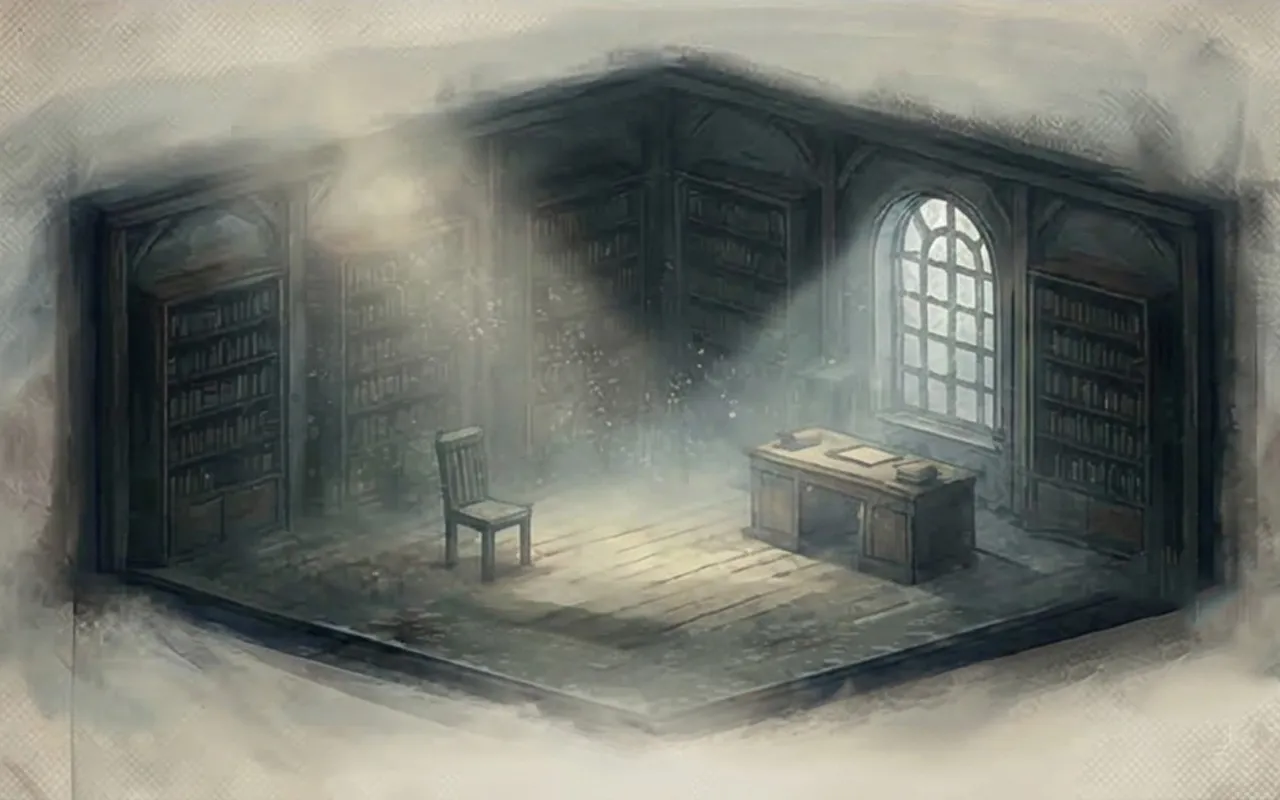
7. Atmosphere Breathes Life
Atmosphere is what separates a digital model from a lived-in world. It's not just fog or glow—it's space between things. It's the distance between figure and wall, the bounce of light off a surface, the hint of air in the room.
Atmosphere tells us the world has depth, weight, and movement, even if no one is speaking or walking through it. It gives the image breath.
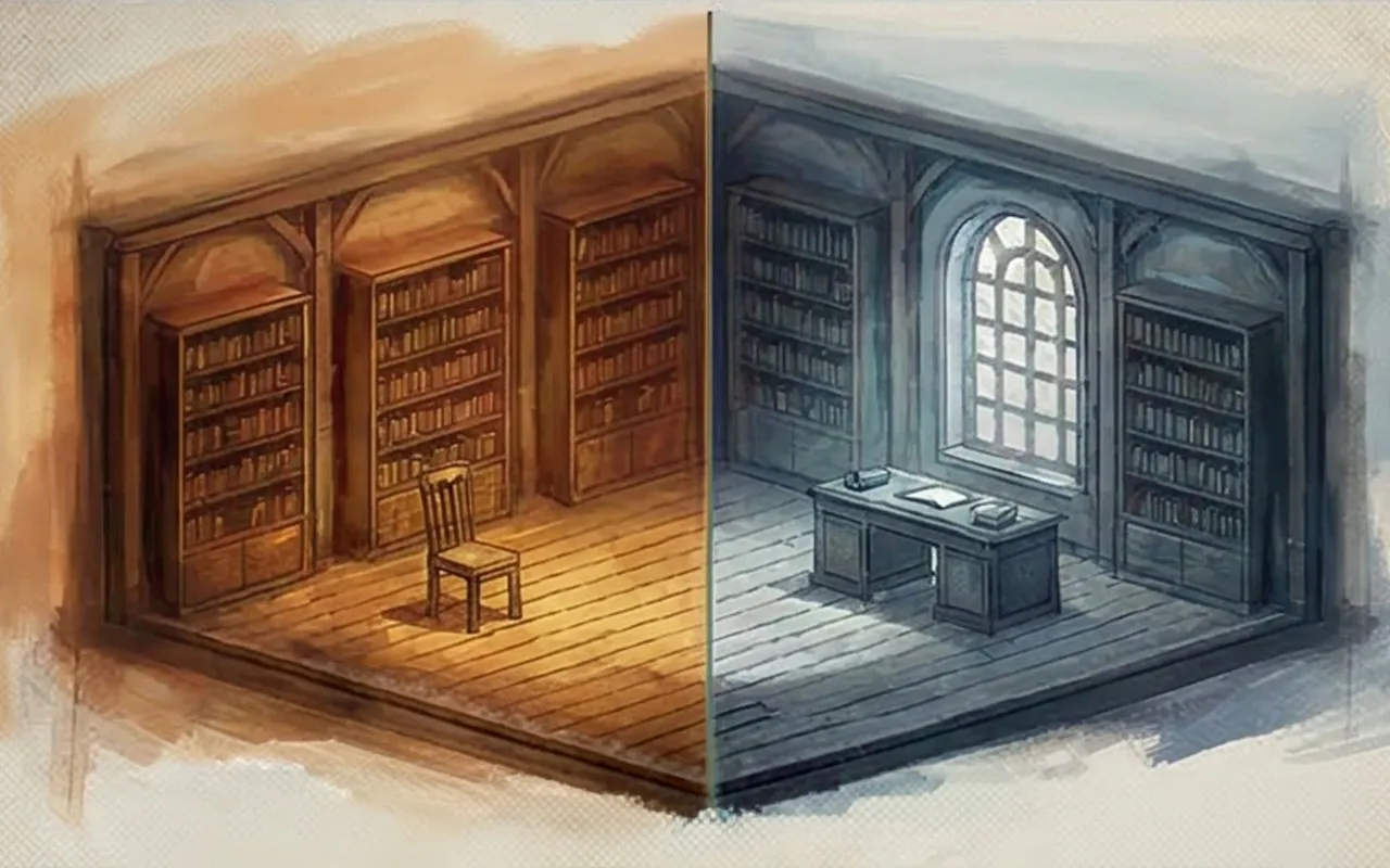
Taken together, these principles are not a checklist so much as a way of seeing. A successful scenic rendering does not simply document a set. It organizes attention, creates emotional temperature, and helps other people understand the world of the production before it is built.
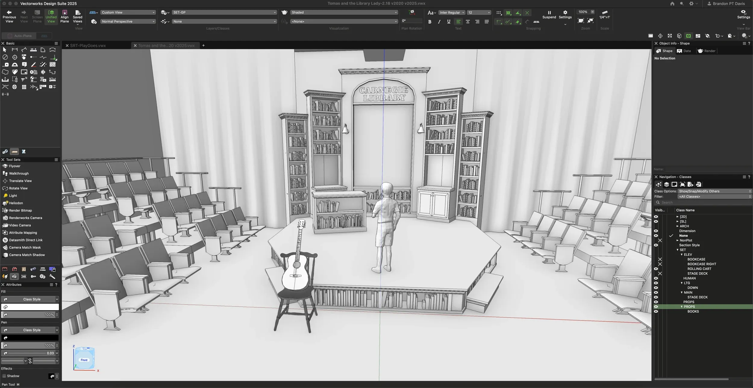
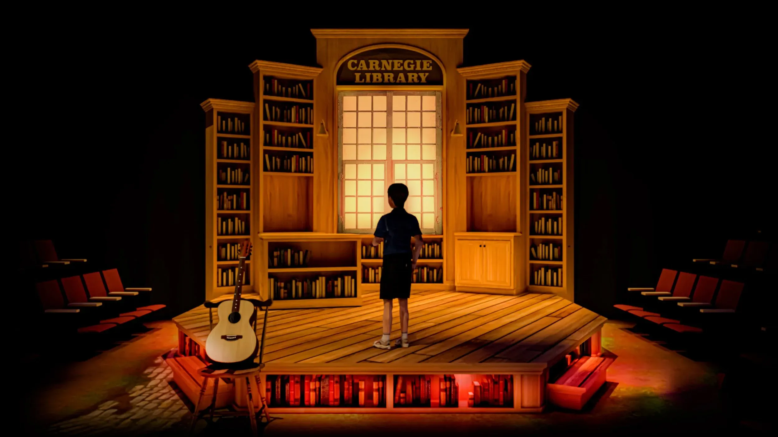
That is why I return to the rendering for Tomás and the Library Lady. It is not successful because it is detailed for its own sake. It works because story, light, composition, hierarchy, color, and atmosphere all support one another in a single image. The rendering invites the viewer into the world and tells them how to feel once they arrive.
FAQ: Scenic Rendering & Vectorworks
Final Thoughts
Scenic rendering is about more than polish—it’s about precision, composition, and emotional weight. A good rendering isn’t trying to show everything. It’s trying to communicate what matters most.
If you’d like to see how these ideas translate into practice, visit the Rendering & Visualization page to explore examples from past projects.
In the next post, I’ll break down how camera angles and field of view inside Vectorworks can shift the storytelling of your renderings—without adding complexity.